Vintage Visualization Restoration – Bump Chart Edition
Posted by Jim Vallandingham
As a side project, I decided to reimplement a classic bump chart visualization using JavaScript and D3. Check it out here.
My Introduction to the Bump Chart
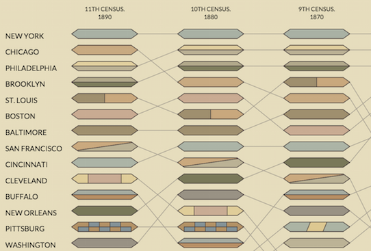
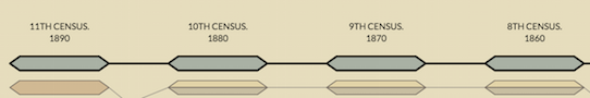
This bizarre but majestic visualization was originally created for the 1890 US Statistical Atlas by the wonderfully talented Henry Gannett. It provides a look at the most populated cities during each census, showing over 100 years of data.
I believe the first time I encountered this chart was when its companion that shows state populations was labelled Most Ridiculous Chart On Earth (In All History). Ridiculous, perhaps, but also beautiful. I wanted to answer the question of how much effort it would be for me to recreate it using only code.
Turns out it takes about 700 lines of code, and nearly 100 lines of configurations to record the color combinations and visual styles used for each city. As there are 90 cities with their own visual style, I’d say this isn’t too bad!
I’d like to go through just a few tricks I learned while developing this little project.
Consider Using use
To reduce the amount of patterns that needed to be rendered, I made use of the SVG use element. This element seems not often used (at least in the visualization code that I peruse), but allows you to define a visual element once, and then use it multiple places without recoding. For the “pills” used to represent each city, each is defined in the defs section of the SVG, with an unique Id:
defs = svg.append("defs");

var defpills = defs.selectAll("pill")
  .data(pillTypes)
  .enter()
  .append("g")
  .attr("id", function(d) { return d.id; })
  .attr("class", "pill");
We can see that the visuals for the different pill types are themselves encoded in a pillTypes data array, which we will look at next. The elements in the defs section aren’t visible in the SVG, but can be used in the main body of the graphic to make them visible. So, if we have a g for every year column in the visualization, we can add our pills for every city in that year using use:
year.selectAll("pill-use")
  .data(function(y) {
    // get data for each city
    // in this year
  })
  .enter()
  .append("use")
  .attr("xlink:href", function(d) { return "#" + d.id;})
  .attr("class", "pill-use")
  .attr("transform", function(d,i) {
    return "translate(0," + (d.value - 1) * (pillHeight + pillSpace) + ")";
  });
Pretty cool right? I first saw use mentioned in the handy SVG Pocket Guide by Joni Trythall. It includes a lot of other great stuff on how to use SVG to the max – and you should definitely check it out.
The data that powers the visualization has a row for every city. For each year, we can filter down the list to the cities that appear in that year, and plot their ranks.
Interacting with the use
I added a little layer of interaction to this graphic to make things easier to understand. Mousing over a city pill will highlight the city throughout the entire chart. Since each pill is actually an use element, this made visually changing these elements a bit different then what is typically done. It turns out that you can modify the original elements in defs that the use elements are linked to make them all change consistently. For the highlighting, I simply added classes to these element groups to change their style:
function mouseover(d,i) {
  defs.selectAll(".pill")
    .classed("highlight", function() {return d3.select(this).attr("id") === d.id;})
    .classed("unhighlight", function(e) {return e.id !== d.id; });
  // ...
}

function mouseout(d,i) {
  defs.selectAll(".pill").classed("highlight", false);
  defs.selectAll(".pill").classed("unhighlight", false);
  // ...
}
This works for updating all of the pills of a same type. If I wanted to modify a single instance of a use element, then things wouldn’t be so easy. It would have to do be done through adding elements to the SVG to obscure or otherwise modify that instance, which could turn into a lot of work, depending on what you are going for.
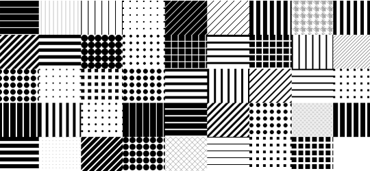
Patterns can be Data Too
Above we saw that our pill instances were created using an array of pillTypes. This array stores an object for each of the unique visual patterns displayed. Here is a taste:
var pillTypes = [
  {func:oneColor, opts: {colors:["#A8B2A5"]}, id:"ny", name:"new york"},
  {func:oneColor, opts: {colors:["#D4AB80"]}, id:"chi", name:"chicago"},
  {func:twoColor, opts: {colors:["#E9D19E","#C0B295"]}, id:"phi", name:"philadelphia"},
  // ...
];
In this way, we can represent these patterns in data – to minimize code duplication and make it relatively easy to add a new pattern. And what is this func attribute you ask? Why it is the name of a function that will actually create the pattern. Each pattern style gets its own function, with a consistent signature. Here is twoColor:
  function twoColor(selection, width, height, opts) {
    selection.selectAll("rect")
      .data(opts.colors).enter()
      .append("rect")
      .attr("x", 0)
      .attr("y", function(d,i) { return (i * height / 2); })
      .attr("width", width)
      .attr("height", height / 2)
      .attr("fill", function(d) { return d; });
  }
The opts object provides the customization to these pattern functions to make them unique for each city. New elements are appended onto the selection, which is the base group for each pill. This way, repeated patterns like a solid color, or a split pill can use the same function and just change the colors. It was the only way I could think of doing this and staying sane – but if you have another idea, I’d love to hear it!
Of course reuse wasn’t an option for everyone of these patterns. Not sure what Henry had in mind when he made Baltimore.

Details and Devils
The main reason I enjoy reimplementing these classic visualizations is to try to better appreciate and understand the design choices and level of detail that went into making them. To do something like this by hand, with no code, computer, or even scroll wheel – it boggles the mind!
One seemingly obvious attribute of this visualization that I completely ignored until I began to implement it is that time goes from right to left. While most timelines want to start in the past, this one brings you to the current (at the time) day and lets you explore how each city got there.
Labelling, as always, was one of the hardest parts of this graphic to faithfully reproduce. It is obvious that the original creators spent a lot of time on getting the most out of the annotations while striving for simplicity and elegance.

Cities are labelled on the most recent year they appear, as well as their first year on the list. If there is space, this label is put on the side of the pill, else, it is layered on top. There are three cities, Wilmington, Petersburg and New Bedford that drop off the list, only to reappear in later years, and so additional labels are used. My already hacked-up code for displaying these labels failed completely with these edge cases. I decided to hard-code these exceptions and accept defeat, rather than contort my process further and attempt a more general case solution.
For more great details, check out this CityLab piece that covers this same chart as restored to pristine condition by HistoryShots. This restoration served as the basis for colors used in my implementation – to try to get it as close to the original as possible.
So now you can rest a bit easier at night with the knowledge that a bit of Henry Gannett’s legacy has found its way into the digital acropolis of modern data visualization. I know I will!
And if you enjoy other superfluous digital remakes of vintage visualizations, check out my previous experiments as well as Irene’s wonderful SVG Pattern Fills library.
Now you’ll have to excuse me as I peruse another Gannett classic that promises to be a real page turner: The origin of certain place names in the United States.
Have a favorite historical graphic or visualization? Let us know in the comments or on Twitter!