Stereotropes Design
Posted by Irene Ros
![]()
Our Data Visualization team recently launched a new project called Stereotropes, an interactive experiment exploring the relationships between gender and the words used to describe common tropes found in film and TV.
In this post, we wanted to share some of the design process that went into turning the raw trope data into an interactive and exploratory experience.
A Gender Perspective
Tropes represent conventions and sometimes stereotypes that are used commonly to identify different groups of people, places, or actions. We aimed to develop visualizations to explore this data in both a focused look at individual tropes and in aggregate by looking at what these tropes mean and what they say about our culture and our media.
As we began to dive into the data, we discovered that tropes which specifically describe people (character tropes) were the most interesting to us personally. They also happened to be easily categorizable in a few different ways, most especially gender. We immediately discovered a lot of these tropes as “stereotypes” we’ve heard of before and decided to dive in deeper on the question of gender representation in movie tropes.
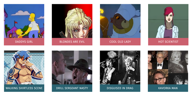
Examples of Always Female and Always Male Tropes.
Using Descriptions
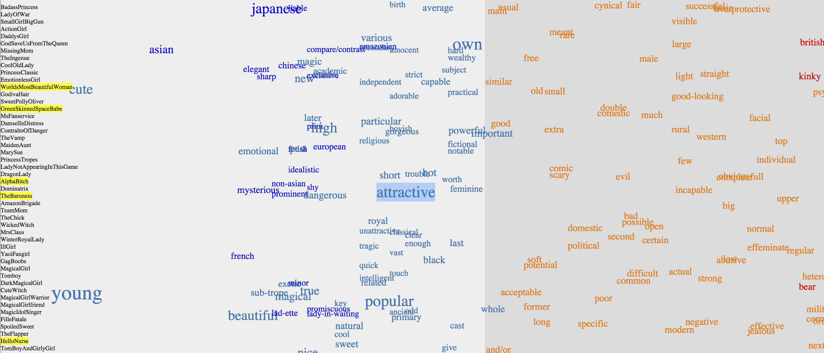
Now that we knew the tropes we wanted to look at, we needed to extract data from these tropes that could be used to analyze gender representation. We decided to harness the subjective descriptions written to describe each trope by the community members of TV Tropes. While imperfect, they provide a viewpoint on how these tropes were understood and what they represented.
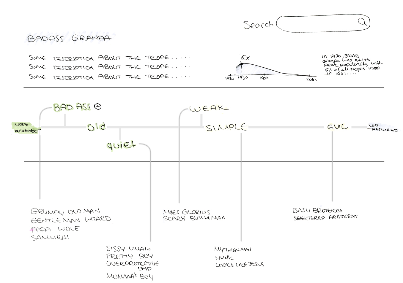
The adjectives used to describe the trope Badass Grandpa
Prototypes and Sketches
We developed number of sketches and prototypes to explore ways to communicate this data to a public audience. We wanted the final experience to focus on exploration and finding connections while also making the data relatable without overwhelming users with too much detail.
Tropes Visualizations
We started with an exploratory tool that showed all the adjectives related to each trope, and allowed for filtering based on shared adjectives.
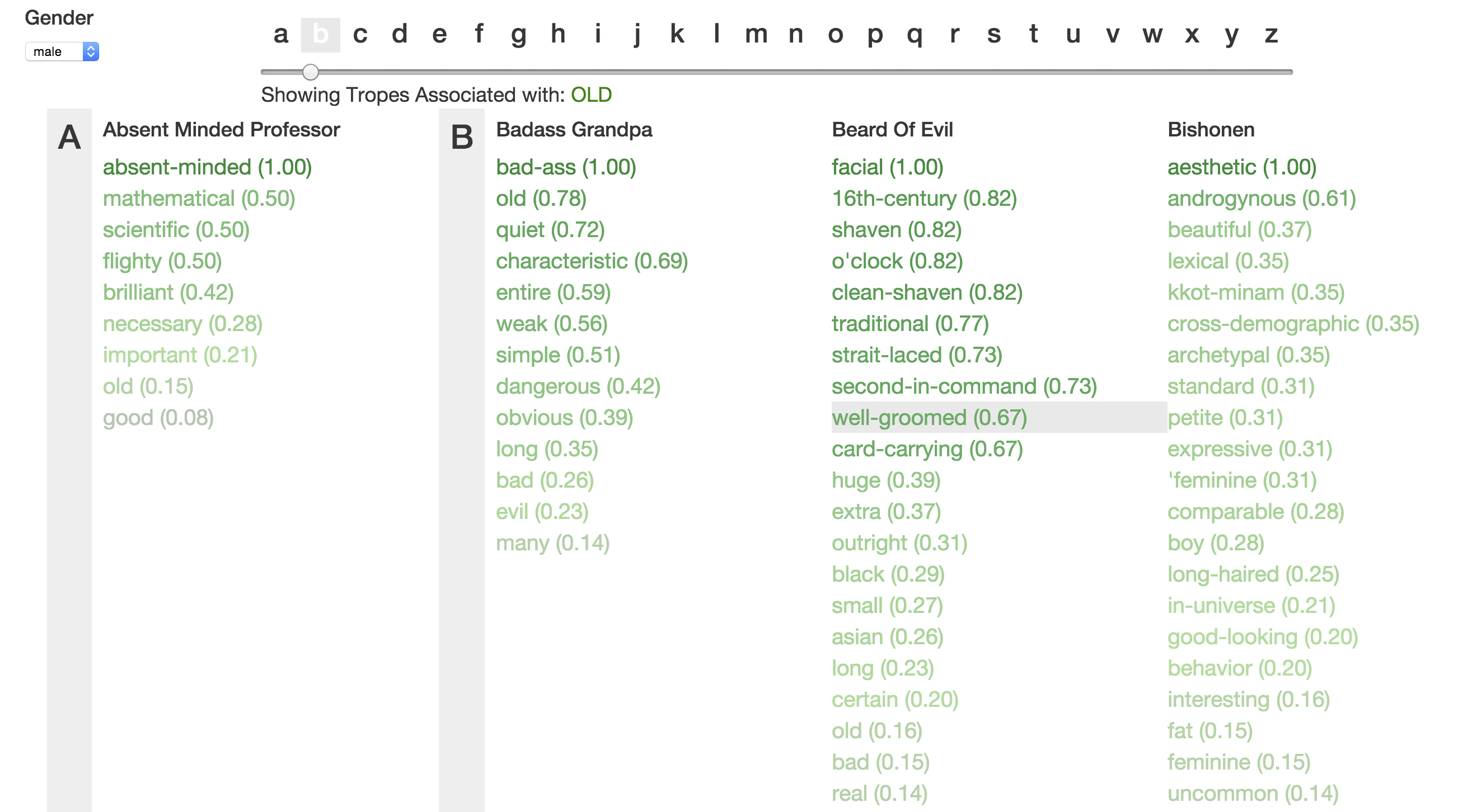
Trope-adjective exploration tool, filtering on tropes that use “old”
This tool was a fun way to explore the data, but we quickly realized that the most interesting part was that filtering capability: when one would click on an adjective, only tropes that share that adjective would remain in view. There were a few challenges with this design:
- The width of each trope’s adjective list only allowed some tropes to be visible at once, requiring a lot of side-scrolling (the worst kind).
- In each trope list, the adjective log likelihood scores, indicating which adjectives were particularly associated with this trope, were represented in a simple list. This did not allow us to actually see the numeric distance between adjectives (despite our attempt at using color gradation to do so.) Some were very strongly associated, while others, not as much.
To combat these issues, we started exploring forms that would allow us to include more information and focus on connections between tropes through those shared adjectives. We experimented a bit around using just adjectives as the main exploration tool, which would then link to tropes associated with this adjective. The adjective-centered design below worked well for showing linked tropes, but did not offer a visual way to inspect the ranking of the adjectives themselves. We decided we really wanted to make good use of those log likelihood scores in our final design.
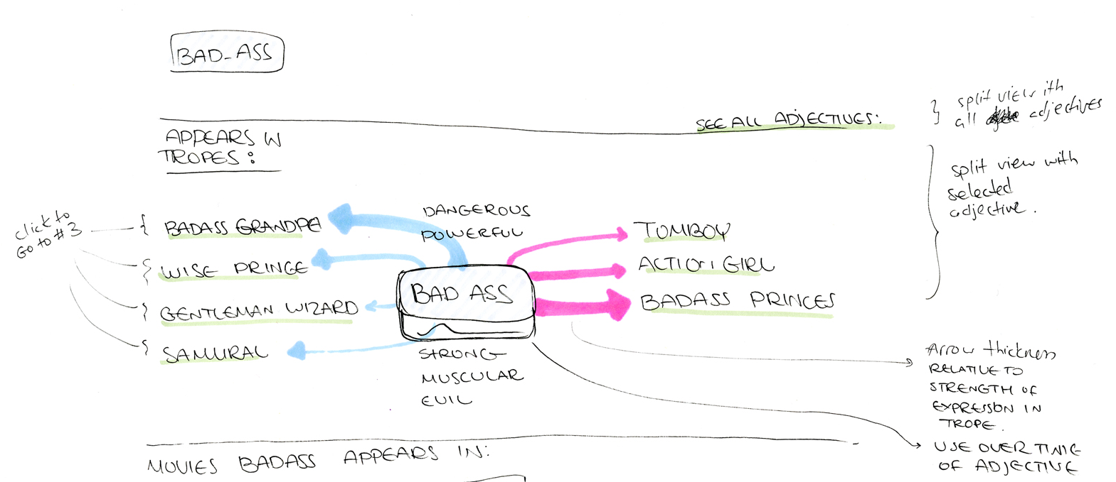
Sketch of an adjective centered design, showing tropes related to “Bad Ass”
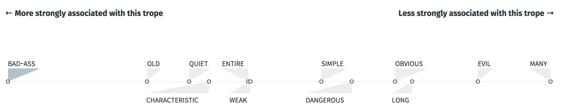
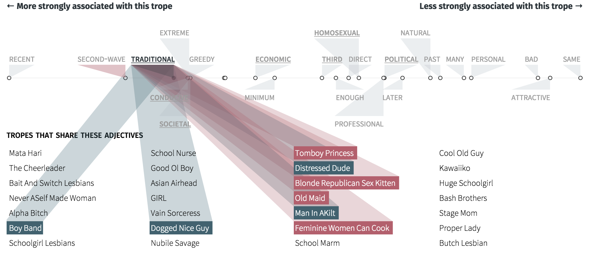
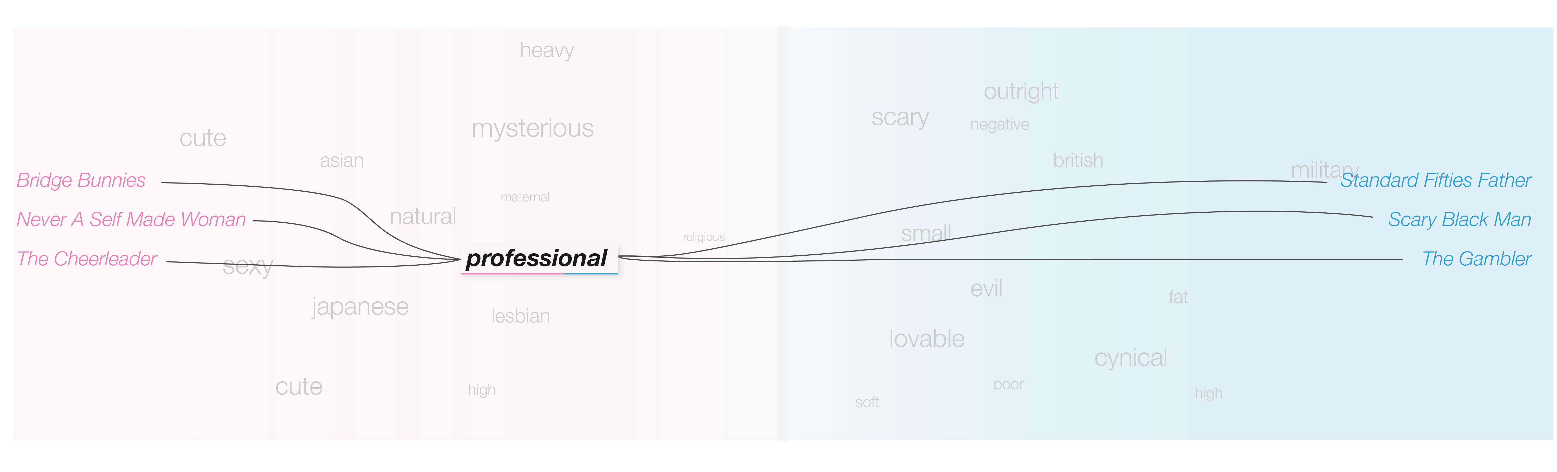
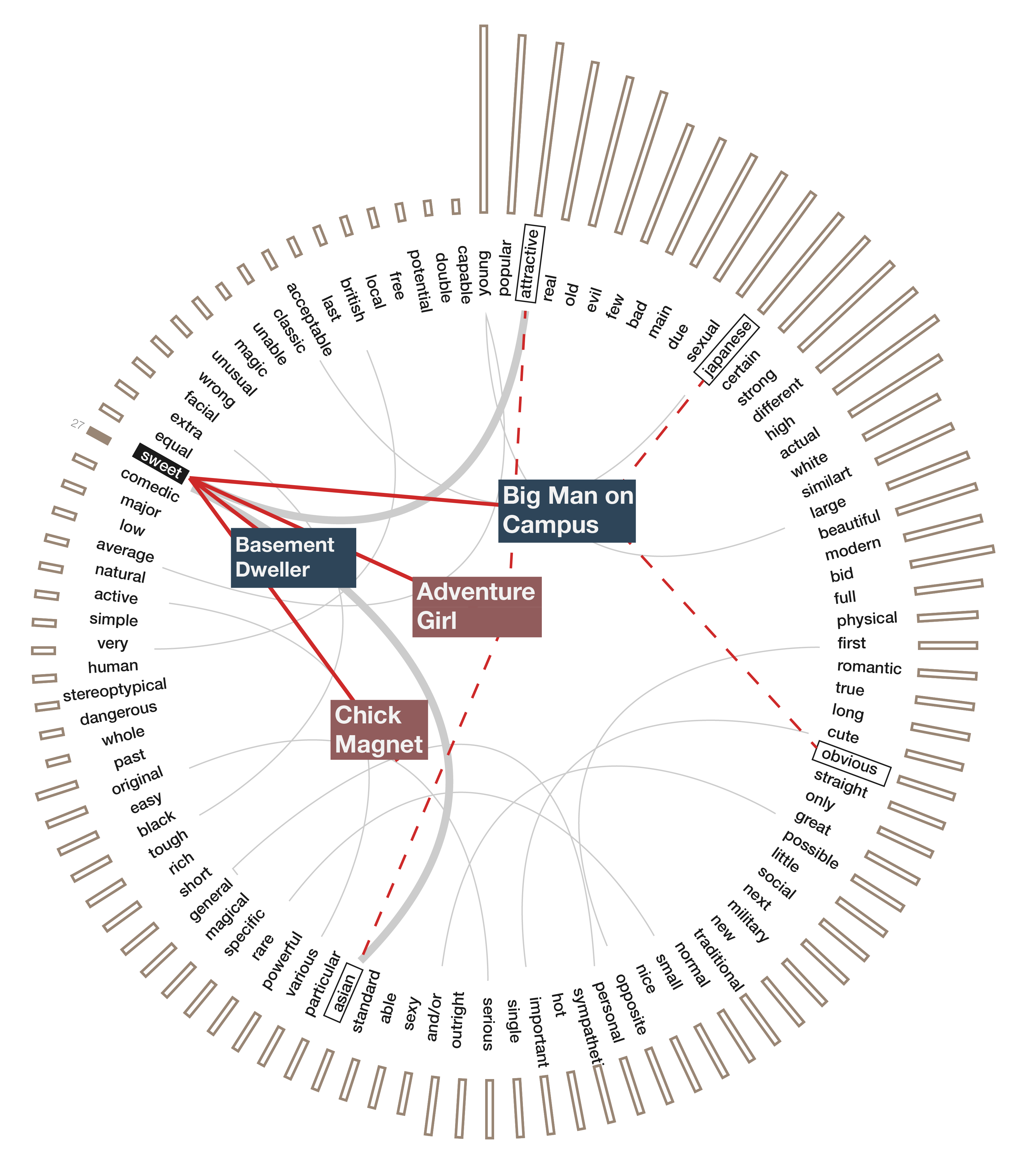
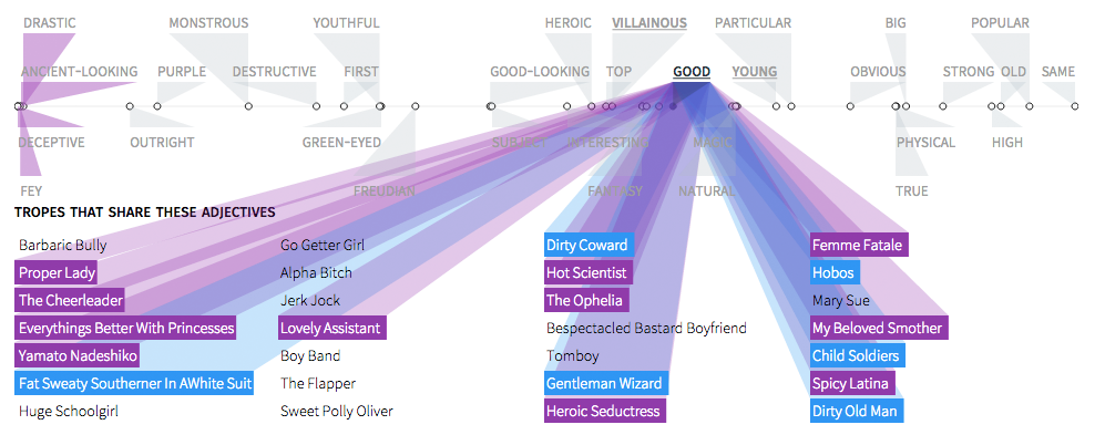
Our next and last design for this section, focused on aligning the adjectives of a trope along the horizontal X axis, ordering them by their log likelihood score. Those that would be more strongly associated would be closer to the left, and those less associated would be closer to the right. Then, we listed related tropes below and connected them through adjectives.
First sketches of an individual trope page, showing related tropes based on shared adjectives
The final implementation, included some aesthetic elements we added as part of our experimentation. Small triangles were added to underline the adjectives on our scale. Without them, the words seemed to “float”, even if we anchored them with a single line. Additionally, we added semi-opaque “beams” to connect tropes and adjectives. Using such a visually heavy form allowed our audience to see at a glance whether certain adjectives had a lot of connections.
Other visualizations were considered for the trope page – but ultimately excluded from the final piece in order to maintain focus on the words and the associations between other tropes.
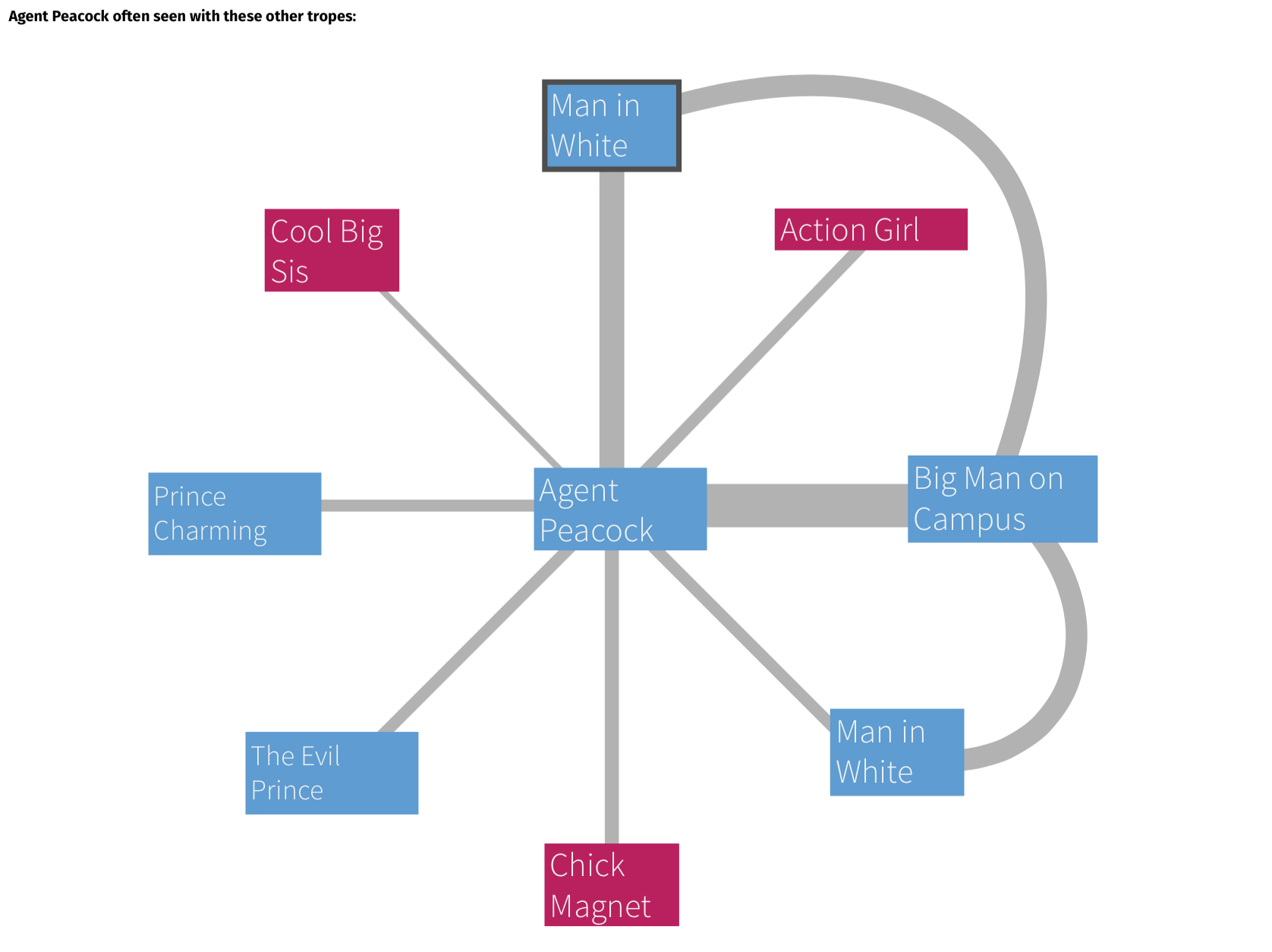
Scrapped network based visualization of tropes appearing in the same movie.
Tropes Use Over Time
Initially, we wanted to make trope usage over time a more immersive and explorable aspect. Each trope in our data set listed all the films it appeared in. The films then listed the decade they were made in, which allowed us to connect the tropes and decades more directly. We developed a prototype tool to allow for comparing the change in popularity of multiple tropes at once.
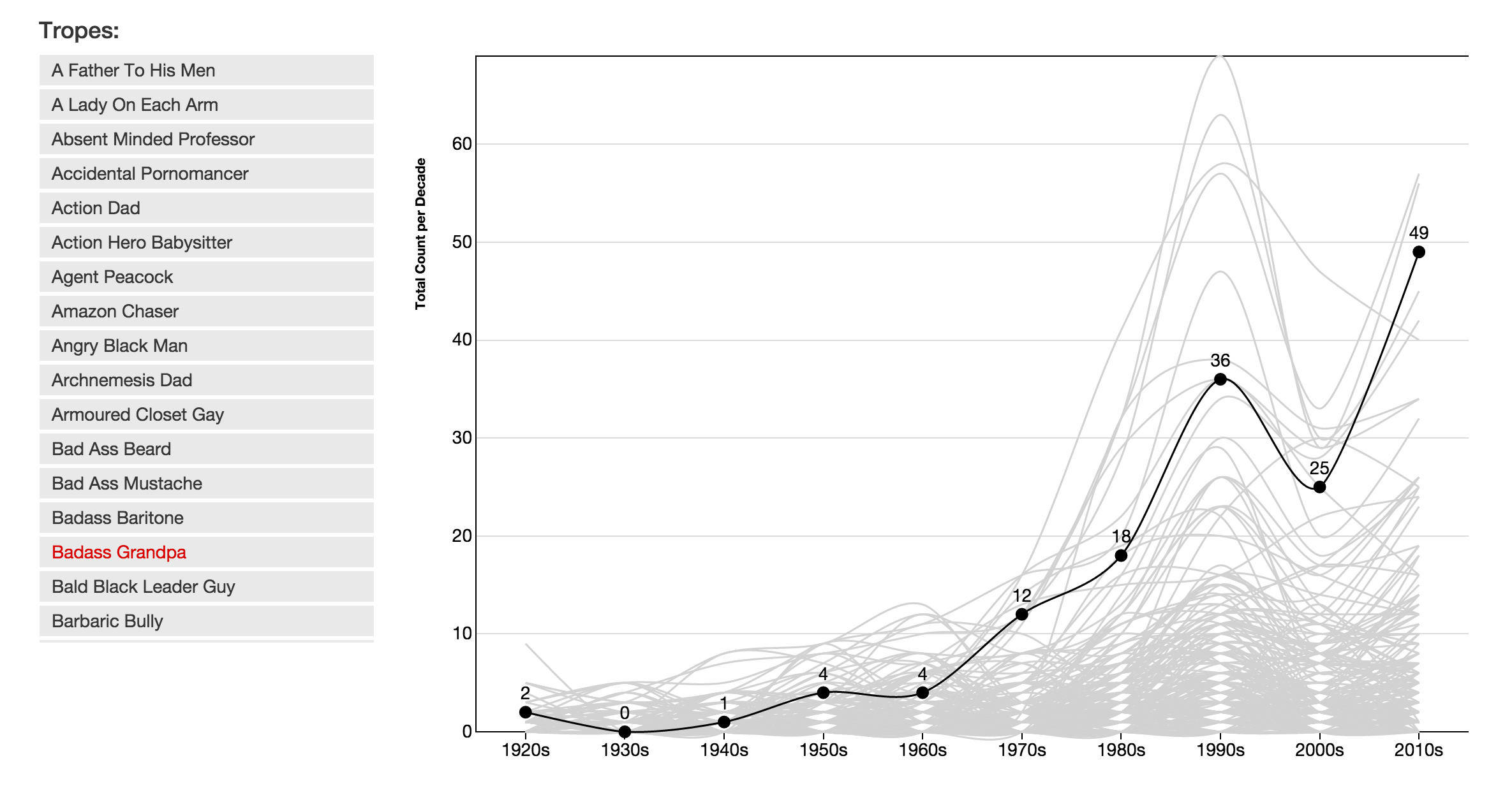
Prototype of trope popularity timeline tool, showing counts for individual tropes over time.
There were several challenges with this design:
- We had a very different number of films in each decade. Naturally, more modern films received better coverage than older ones did, so we really couldn’t use raw counts as a basis for comparison.
- When we looked at the percent of trope use per decade instead of counts, we saw that there were basically three interesting patterns: Either a trope was becoming more popular, less popular or its use has been about the same. That’s really all we could say about them.
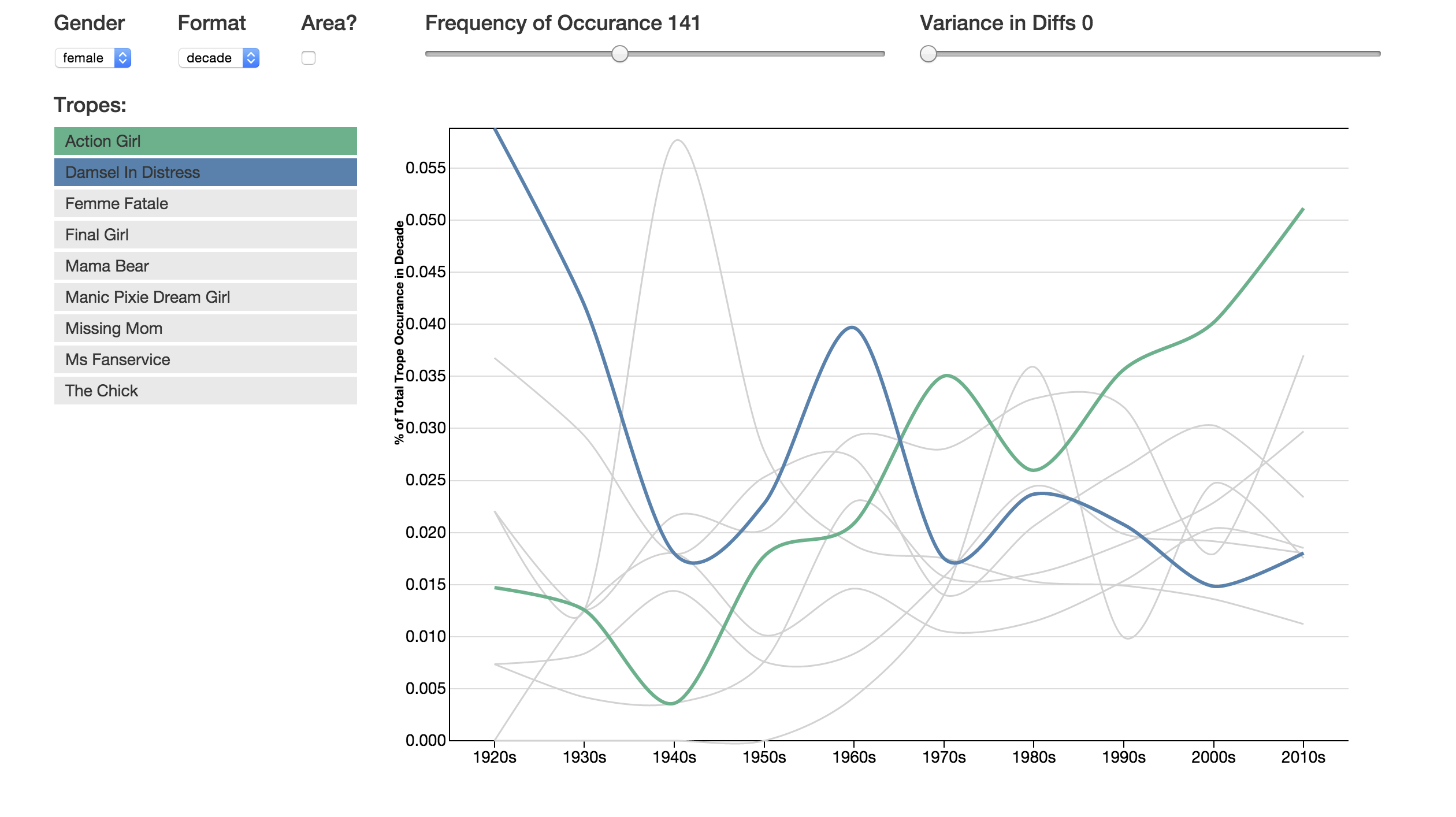
Example: decline in Damsel In Distress and the increase in Action Girl over time
In the end of the day, exploring the trope use over time led us to wanting to see this data on an individual scale more than anything. We were looking for one of those patterns, and so we wanted others to be able to see them quickly too. We still think it might be interesting future work to further explore the relationships between tropes in this dimension.
Gender Visualization
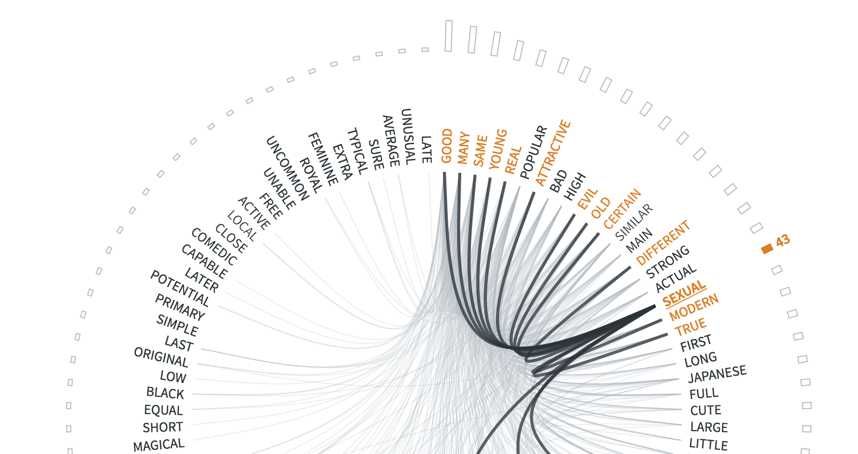
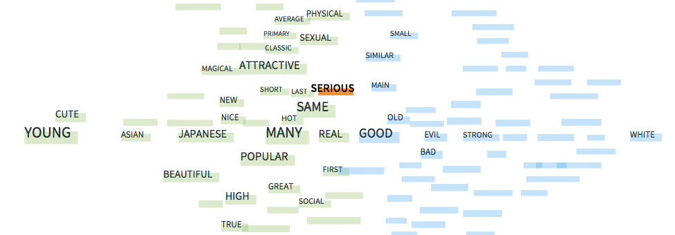
The gender visualization started as a prototype for evaluating adjectives across the entire dataset. Specifically we wanted to see if we could find adjectives that were particularly male or particularly female. By looking at the full collection of adjectives, we could start asking questions like “what adjectives are more likely to describe male tropes but not female tropes, and vice versa?” or “what adjectives are fairly gender neutral?”
Using our prototype, even in its roughest stages, we saw how different adjectives were applied along the two gender extremes and knew we wanted to share this with our audience.
Gender prototyping tool highlighting tropes considered “attractive”
Initially, we wanted to show tropes and adjectives in the same visualization using a layered approach.
A layered approach to showing both adjectives and tropes at the same time
However, the number of tropes associated with some adjectives made this strategy infeasible. Even when we only showed subsets of the tropes relevant to the adjective, having the male and female lists on either side of the screen made them harder to read and reduced the amount of horizontal space we had to lay out the adjectives. Instead, we opted to have the visualization only include adjectives and used a custom tooltip to allow scrolling through the list of associated tropes. We also did away with the gradient background, replacing it with a horizontal bar above and below the visualization and popup showing the balance. It’s a subtle touch, but a good marker for a quick glance.
One of our favorite interactions is the hover-to-reveal aspect of the Gender visualization. By default we only show a small number of the top adjectives used overall (irrespective of gender.) By hiding the others, we reduce the visual clutter of the visualization. Incidentally, the interaction of hovering to reveal the hidden adjective is a really fun one. It also allows you to focus on a subset of the “word cloud”.
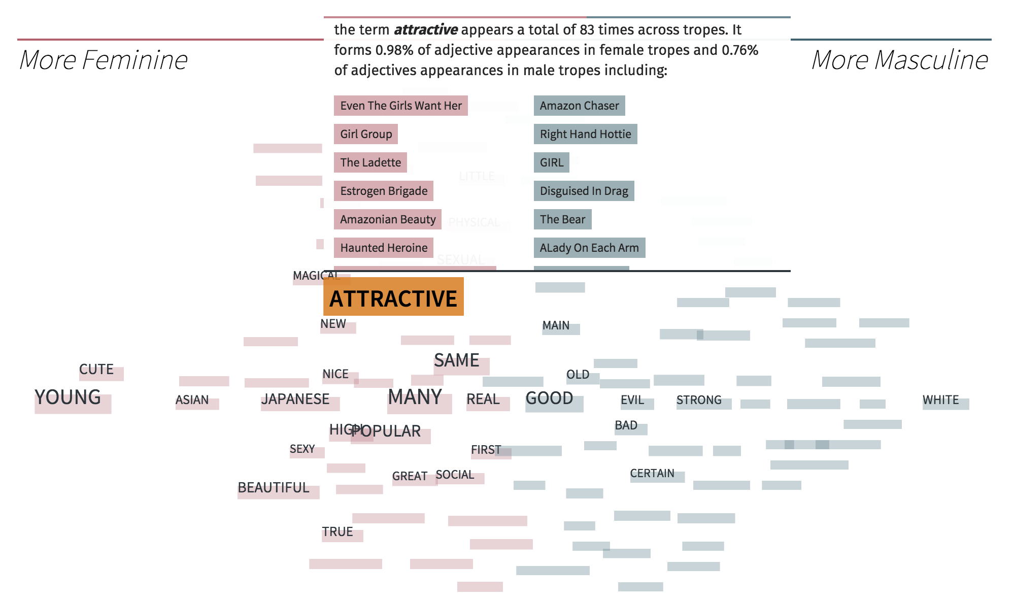
The final gender visualization with tooltip showing related tropes
Adjective Visualization
The top adjectives visualization remained surprisingly consistent throughout the development of the project.
An early mockup of the top adjectives visualization
Initially, we wanted to show many different types of connections between the words and the tropes involved. As it turned out, the top most adjectives in our dataset co-occur very frequently with each other. This meant that the number of connections was very high and not nearly as informative as we wanted it to be. We removed the trope connections to make the visualization easier to understand and focused on the adjective co-occurance.
Detail of the finished piece
Formalizing the Design
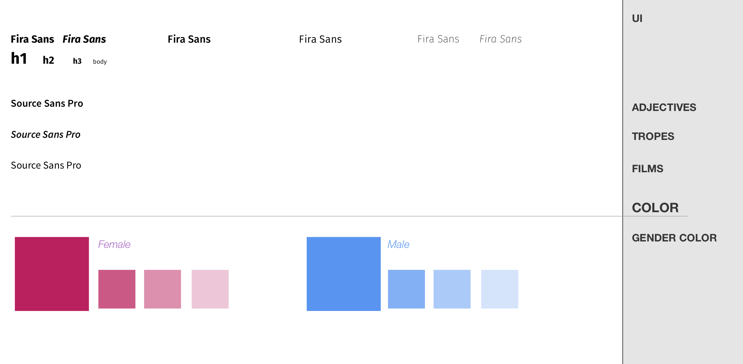
To build the interactive experience, we developed a formal design document that defined the scope of the project, as well as a standard look and feel. Things like colors and font sizes were made explicit.
First page of design document
Defining all this prior to the start of developing the site was imperative for us to work concurrently on the project as a team. Each component on each section was built independently from the others. Our visual style guide also informed the way we designed our shared stylesheets, allowing for very rapid iteration on different color choices and fonts. This was crucial during our attempts to settle on gender colors.
A Word About Color
You can see from the original design document above that the color choices do not match the ones used in the live version of Stereotropes. In fact, choosing a color was one of the hardest task we had on our hands. We tried different colors many times while developing the project.
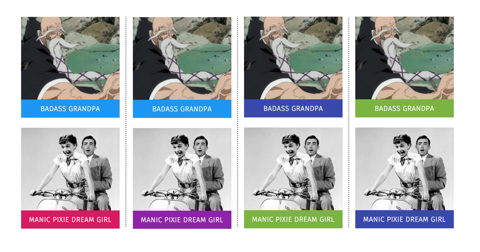
Permutations of colors we experimented with. Colors in the top row correspond to a male trope called Badass Grandpa, while the bottom ones all correspond to a female trope called Manic Pixie Dream Girl
We wanted to be sensitive to the implications of bright pink and blue, which are so commonly used in Western cultures to indicate gender. These colors carry a lot of baggage and feelings of restrictiveness outside of our data’s context; we didn’t want to bring those feelings to Stereotropes, if we could avoid it. Nonetheless, we had one very obvious challenge: here we were attempting to show a continuous spectrum of gender through its use in language despite the explicit binary categorization of the dataset.

Original colors we tried to use were too “plastic”, “Girly”, and “Barbie”
At the same time, moving away from some identifiable pink/blue colors slowed down our beta testing audience in orienting themselves within the visualizations, which substantially distracted from the experience. We tried to vary the pink color we used for the female tropes by changing it to lavender or green, but that immediately became confusing on some of the denser visualizations, like the trope adjectives or gender visualization.
The trope visualization, substituting lavender for pink, was confusing to read
The gender visualization, substituting green for pink, reduced the identifiability of the female associated adjectives when set next to the far more identifiable blue color
Ultimately, we decided to use pink and blue, but in non-traditional hues. Our grey-ish blue and salmon-ish pink are not typically used in popular culture. Some might say (or have said) they are a little “weird”. Nonetheless, they were identifiable to our testers without carrying as much baggage as their more traditional bright counterparts. Our hope here is to choose colors that keep the visualization readable, but distant enough from these traditional variants so as to be noticeable. An uncanny valley of color, if you will.
Logo Considerations
The final site showcases a simple, but descriptive logo that highlights the gender focus of the interactive and works to familiarize the audience with the color scheme.
![]()
Stereotropes logo
Starting out, we had experimented with logos that more explicitly referenced the gender focus through male/female profiles (originally from the Noun Project)
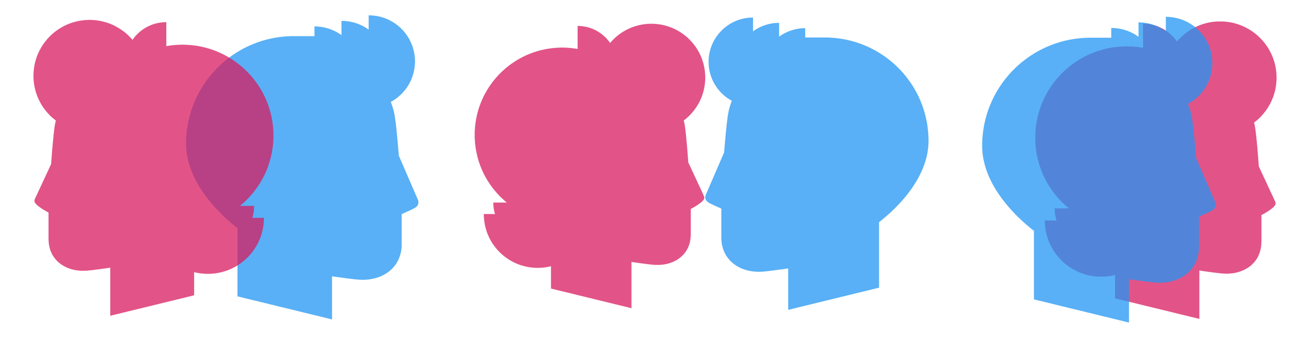
Some initial logo concepts
After some discussion, we realized the heads were distracting due to their due to their Archie-comic-like styling and playfulness.
We returned to the drawing board and just planned for a text-only approach to branding.
Isaac, one of Bocoup’s amazing designers provided us another alternative along with some wonderful guidance for structuring the site.
![]()
An alternative Stereotropes logo design
We liked the framing initially, but the dark background turned out to weigh down the top of the site too much and the border started looking like a beveled edge, and so we chose to keep looking.
In a flash of inspiration at the eleventh hour, Irene developed what would become Stereotropes final logo. It couples the simplicity of Isaac’s design with the duality of the topic at hand. Plus, it makes an S!
Putting it All Together
Really this project came together through the hard work of not just the Data Visualization team, but also our other designers and developers at Bocoup who provided invaluable feedback, suggestions, support, and hours of beta testing.
We want to share this hard work with everyone, which is why the source for Stereotropes, as well as the data analysis is open source. Hopefully sharing these additional design details help explain the process of how Stereotropes came to be.