Smaller, Faster Websites
Posted by Mat "Wilto" Marquis
The following is a transcript of a talk given at various events throughout 2015, including Bocoup’s own TXJS and Boston JS.
Transcript

My name is Mat Marquis, of Marquis Home Renovation. I don’t care about websites. I’m a carpenter.
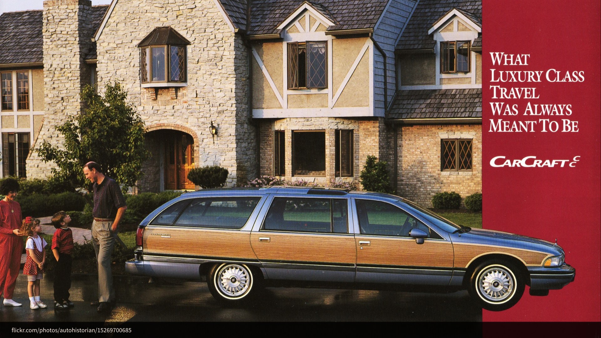
That, you’ll notice, is why my slide deck looks like the side of the most badass station wagon you’ve ever seen.

As for where I work, it’s here. This is my actual workbench; it’s older than I am. Those are my tools; they’re also older than I am. That pile of oak and mahogany on the right is the start of my new coffee table.

As for making websites or whatever, I work at Bocoup—formerly, Filament Group. I’m an editor of the W3C HTML5 specification. I make websites.
But I’m not here to talk about me. You’re not here for me. You’re here with purpose; you’re here to learn, and I am here to teach you…

…about furniture. This is a Queen Anne tea table, thought to be made in either New England or Ireland circa 1750. It came right at the advent of the Federal style that was gaining popularity on the tail of Thomas Chippendale’s much more ornate work—though you could argue that his wide use of mahogany is what led to the Federal style, where woodworkers began to favor simpler designs that better highlighted unique grain patterns!
I’ll pause for a second so you can all get some notes down, here. … No?
No, okay—you don’t care. It’s a table. It keeps your coffee off the floor. What this table is—for almost everyone here, I’d bet—is its purpose.
Likewise, you’re here to learn about websites; who cares about me, or about tables? Up here, I’m kinda reduced to my purpose. I’m just a vehicle for transferring information.
So, let’s talk about websites—but not the way I’d talk about furniture, if you gave me half a chance. This is about the user that just wants to keep their coffee off the floor. They don’t care about the website. They don’t care about frameworks; they don’t care about browsers. They want their information and they want to get out. A website, to them, is its purpose.
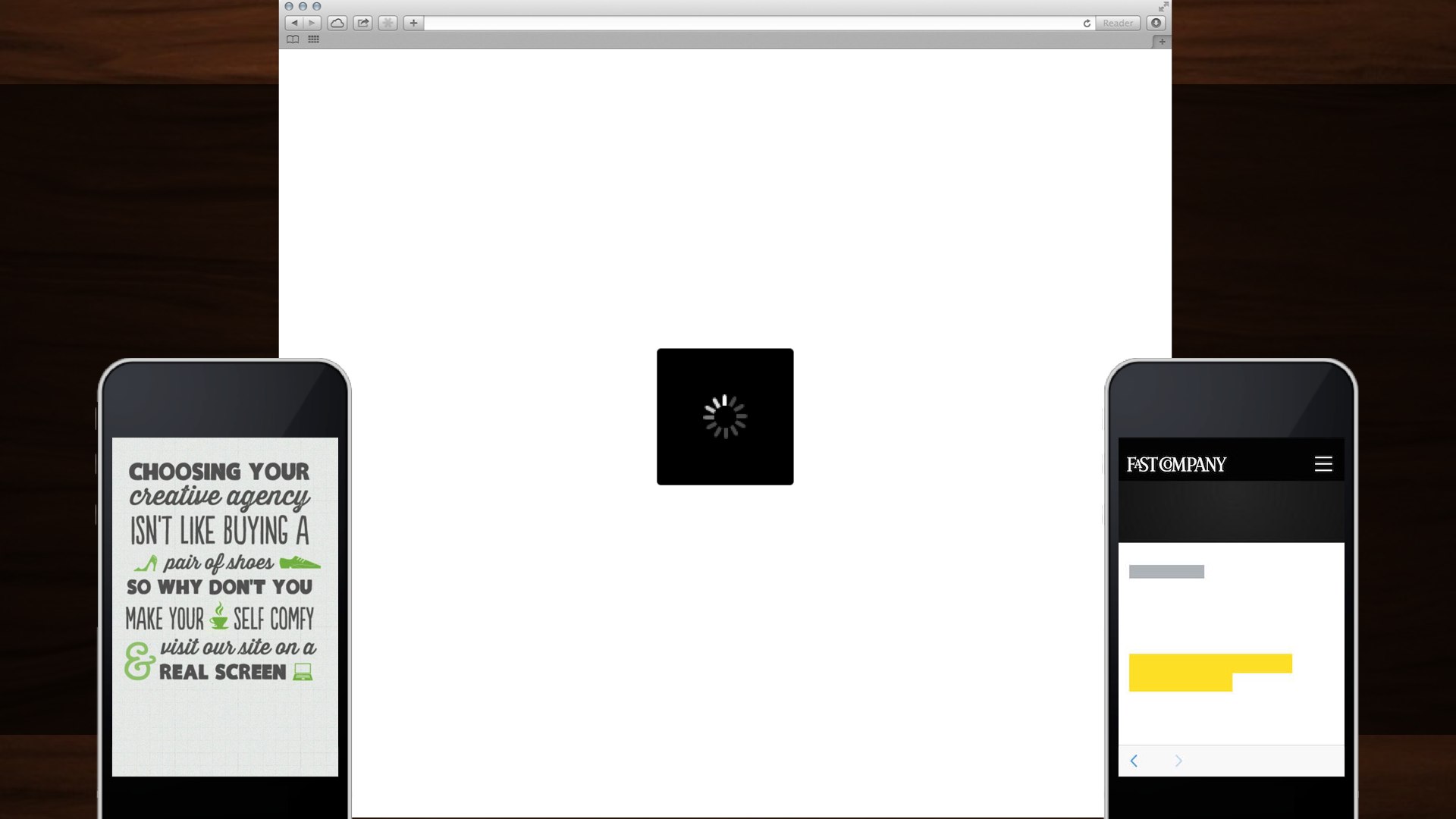
When we present users with a slow website, a loading spinner, laggy webfonts—or tell them outright that they‘re not using a website the right way—we’re breaking the fourth wall. We’ve gone so far as to invent an arbitary line between “webapp” and “website” so we could justify these decisions to ourselves: “well, but, this is a web app. It… it has… JSON. The people that can’t use the thing I built? They don’t get a say.”
We, as an industry, have nearly decided that we’re doing a great job as long as we don’t count the cases where we’re doing a terrible job. We want the user to think about The Website—to sympathize with us—over their reason for being there. We’re making them sit through a lecture about furniture design every time they try to sit down in a chair.

When we prize our own convenience over craft, we’re building a web for us, the developers. We’re building a web that’s easy to assemble but lousy to use.
That’s not what the web is to me, though—that’s not what this job is, to me. The meaning I take from this gig doesn’t come from getting a div to show up in the right place. It comes from knowing that working just a little harder can mean that entire populations just setting foot on the web for the first time will be able to tap into the collected knowledge of the whole of mankind.

We can make this a job where we make something only work as much as it has to in the handful of easy browsers someone put on a list on our desk, or we can make it about working harder than that.
We can make up our minds that we want everything we do to nudge the entire web toward something better, faster, more inclusive. We can build for the web’s purpose: connecting people all over the world. And when we put in that work, we get better at it; we get faster at it. We start doing things the right way by default. We get better. We make that the job.
So, we’re not gonna talk about you and me, and we’re not gonna talk about furniture. Let’s talk about how real people around the world use the web.

| Desktop Traffic | Mobile and Tablet Traffic |
|---|---|
| 64.58% | 35.3% |
Mobile and tablets account for 35.3% of all internet traffic worldwide, and that figure is steadily increasing. In many parts of the world, “desktop” traffic is practically nonexistent. Building massive, resource-heavy sites means excluding millions of users that have only ever known the web by way of feature phones or slightly better—users paying for every kilobyte they consume; users that already have to keep tabs on which sites they need to avoid day-to-day because of the cost of visiting them. I don’t mean some nebulous hand-wavy “bandwidth cost,” either—I mean actual economic cost.

When you take us out of the equation, the world overwhelmingly views the web via EDGE connection. And even here at home, the prevalent mobile connection is 3G at best.
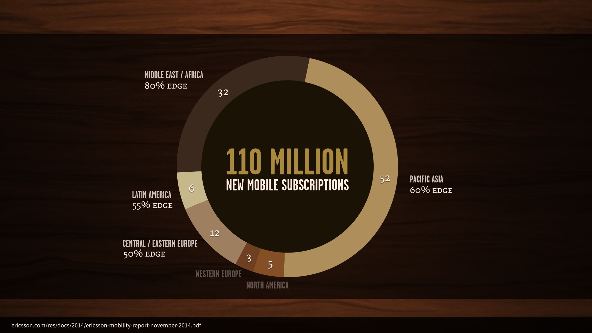
In just the third quarter of 2014, there were one hundred and ten million new mobile subscriptions worldwide. 102 million of these were in areas where the prevalent network is EDGE.
But let’s be honest: these figures are easy to wave off by saying “well, those aren’t our target markets. Here at home, this isn’t really a problem.”
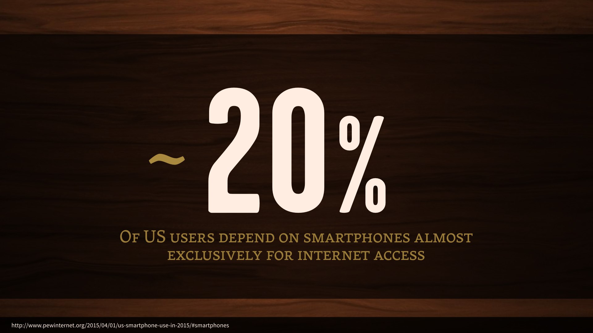
Well, as it stands right now, some twenty percent of US users use their smartphones almost exclusively for internet access—they either have no broadband service, or very limited access to the internet otherwise.
7% of those users have absolutely no access to the internet outside of their smartphones, and that’s the direction things are trending.
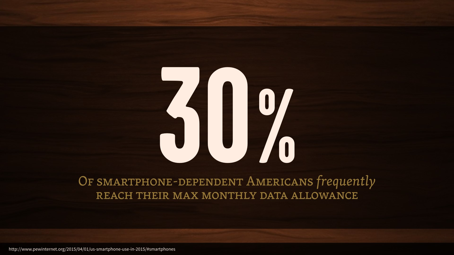
Meanwhile, almost a third of those smartphone-dependent users in the US frequently run up against their monthly data allowance.

Huge, slow websites mean not only letting our target audience down, but making it impossible to expand our reach beyond that audience.

| CSS | JavaScript | HTML | Fonts | Other | Images |
|---|---|---|---|---|---|
| 61KB | 318KB | 61KB | 93KB | 152KB | 1297KB |
The average webpage’s total transfer size is ridiculous. As of a few months ago, we broke the two megabyte mark—and images alone account for more than sixty percent of that.

| Date | CSS | JavaScript | Images |
|---|---|---|---|
| April 15, 2013 | 36KB | 221KB | 856KB |
| January 1, 2014 | 46KB | 272KB | 1028KB |
| April 15, 2014 | 50KB | 282KB | 1104KB |
| January 1, 2015 | 58KB | 295KB | 1248KB |
| April 15, 2015 | 61KB | 318KB | 1297KB |
Now, over the past few years, the average weight of our CSS has barely budged—adding a couple of media queries isn’t to blame for this new page weight.
Our JavaScript has crept up a bit, but given the incredibly rich interactions we’ve seen on the web in recent years, a few kilobytes seems pretty reasonable.
Images, though—those are doing real damage, and for a while things were looking grim. I’ve cited these figures before, in talks; this same chart, in fact, updated from month to month. The reason I’m showing it again here, today, is that something has changed. The average webpage’s image weight is still increasing, but it’s just starting to slow down.

Etsy saw an increased bounce rate of 12% on mobile if we added 160k of images to a page. Lara Hogan
It’s a good thing, too. No matter how nice they are, putting a huge, bandwidth-obliterating wall of images between your users and the thing they came to your site to do will absolutely drive them away. 160 kilobytes is almost nothing to us, but enough to increase Etsy’s bounce rates by more than ten percent.

It is extremely rare where one optimization lets us knock off such a significant amount of page weight, but here we are staring one such technique right in the face. 72% less image weight. Tim Kadlec, Why We Need Responsive Images
Now, I don’t know this for a fact, but I sincerely hope that the slowing trend toward higher image weights comes from all the new, smarter image delivery options that fall under the “responsive images” umbrella.
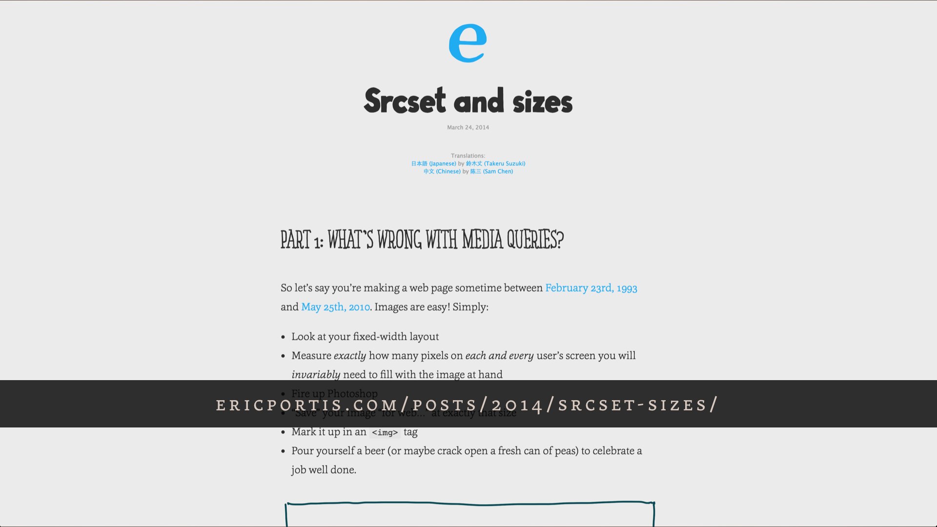
For a lot of you, native responsive images won’t be huge news. Some of you might have heard whispers about a potential solution coming along—or a fight between the WHATWG’s srcset and the picture element put forth by a scrappy band of web standards rebels and their handsome, charismatic leader. Cough.
All that dust has settled, and we got much more out of it than one new element; we got an entire suite of enhancements to the img element to go with it. Native options for dealing with Retina, with the size of an image in a layout, even dealing with alternate image formats—something we’ve never been able to do natively, prior to this year.
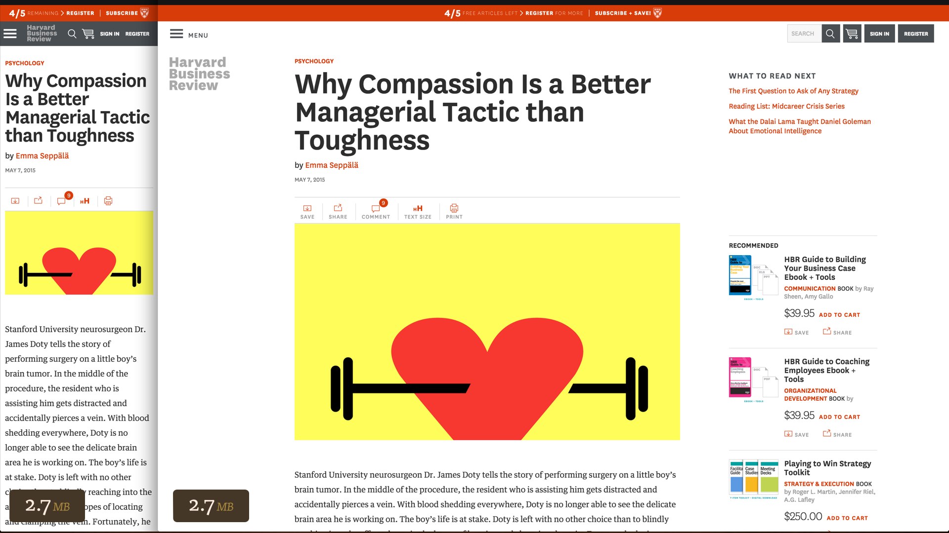
We’re implementing some of these new markup patterns on my current project: the Harvard Business Review website. Unfortunately, their responsive redesign last November didn’t do anything to tailor assets to varying user contexts. Regardless of your viewport size or resolution, an article page always came with all the same assets. A full two megabytes of this page are in images.
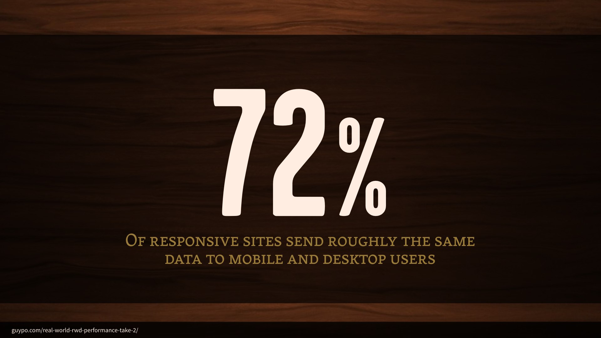
And I don’t mean that to sound like a knock on HBR; they did a great job on this redesign, and they’re not alone in these issues: 72% of responsive sites are sending roughly the same data to users regardless of their context. Only about six percent of responsive sites are taking significant steps to tailor assets to mobile devices.
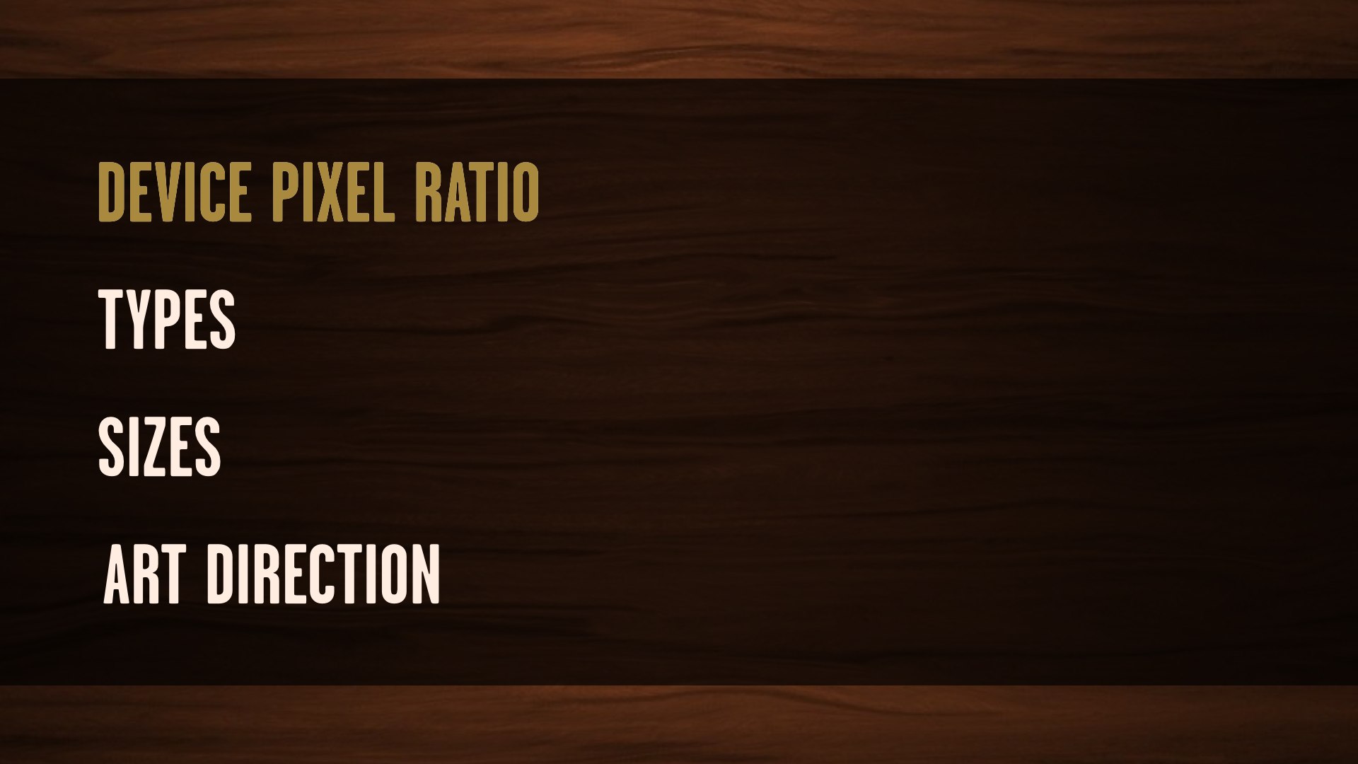
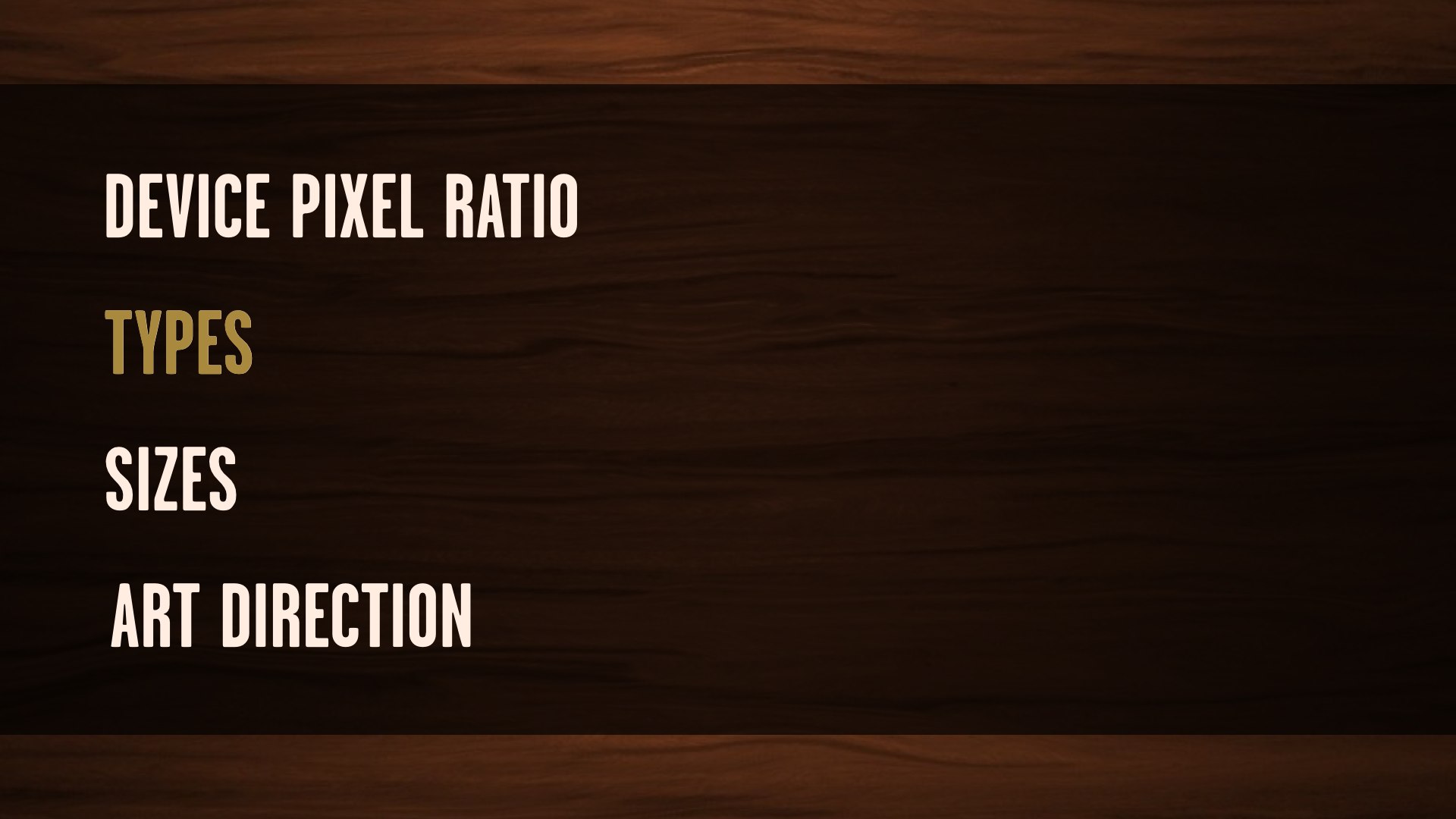
Any work we do with responsive images is more or less gonna break down to some combination of these four use cases. The “device pixel ratio” use case deals only with the pixel density of a user’s display.
These aren’t images that are gonna change in size across our breakpoints, or at least they won’t change much.
We just want high resolution versions for high resolution screens, and low resolution versions for low resolution screens.

<img src="standard.jpg" srcset="high-def.jpg 2x" alt="…">This syntax is pretty cut-and-dry. We use the img element we’ve come to know and love, complete with an old-fashioned src attribute pointing to the standard definition version of an image.
The new srcset attribute then contains the path to the larger source, and 2x—signaling to the browser that this source should be used on displays with twice the pixel density.

Think ofsrcsetas suggestions or just extra information to help a browser decide. Ultimately it can do what it thinks is right. Chris Coyier, Responsive Images: If You’re Just Changing Resolutions, Usesrcset
From a syntax standpoint: saying “do X on a high resolution display” is easy, but knowing when a user wants high resolution images is impossible.
If I’m on a Retina MacBook but tethered to a 3G connection, I probably don’t want massive high-resolution images. So, unlike media queries: srcset is specced as a set of suggestions, telling the browser “here are the sources most appropriate for your display, take them or leave them.” By acting as a suggestion, srcset would allow browsers to introduce user settings like “always give me low-res images” or “give me high-res images as bandwidth permits.”
The “types” use case isn’t concerned with viewport size or resolution—it’s concerned with the image formats supported by the user’s browser. It allows us to use the single-request fallback pattern already built into picture so we can serve alternate image formats in smarter ways.

We observed that the average WebP file size is 25%-34% smaller compared to JPEG file size.Google’s WebP Compression Study
Newer image formats like WebP and SVG come with tremendous potential for savings, but they also come with a major catch: a new image format can’t come with a built-in fallback pattern.

<img src="image.webp"
 data-fallback="image.jpg"
 onerror="this.src=this.getAttribute('data-fallback'); this.onerror=null;"
 alt="…">
The best solutions we had for this all involved the browsing making a request for the file before determining whether we need to throw it away. That means an optimization in browsers that do have native support for the new format, but more overhead for browsers that don’t.

<picture>
  <source srcset="image.webp" type="image/webp">
  <img src="image.jpg" alt="…">
</picture>
But the picture element was introduced for the sake of applying custom logic to image requests before they even go out—and the fallback pattern is baked in.
If the picture element is supported, we can use a type attribute on a source element to tell the browser “only load this source if you support this MIME type, and if not, continue on to load the fallback image.”
In the event that the new markup isn’t recognized, it all gets thrown away except for the one part the browser will recognize: the fallback img element inside picture.
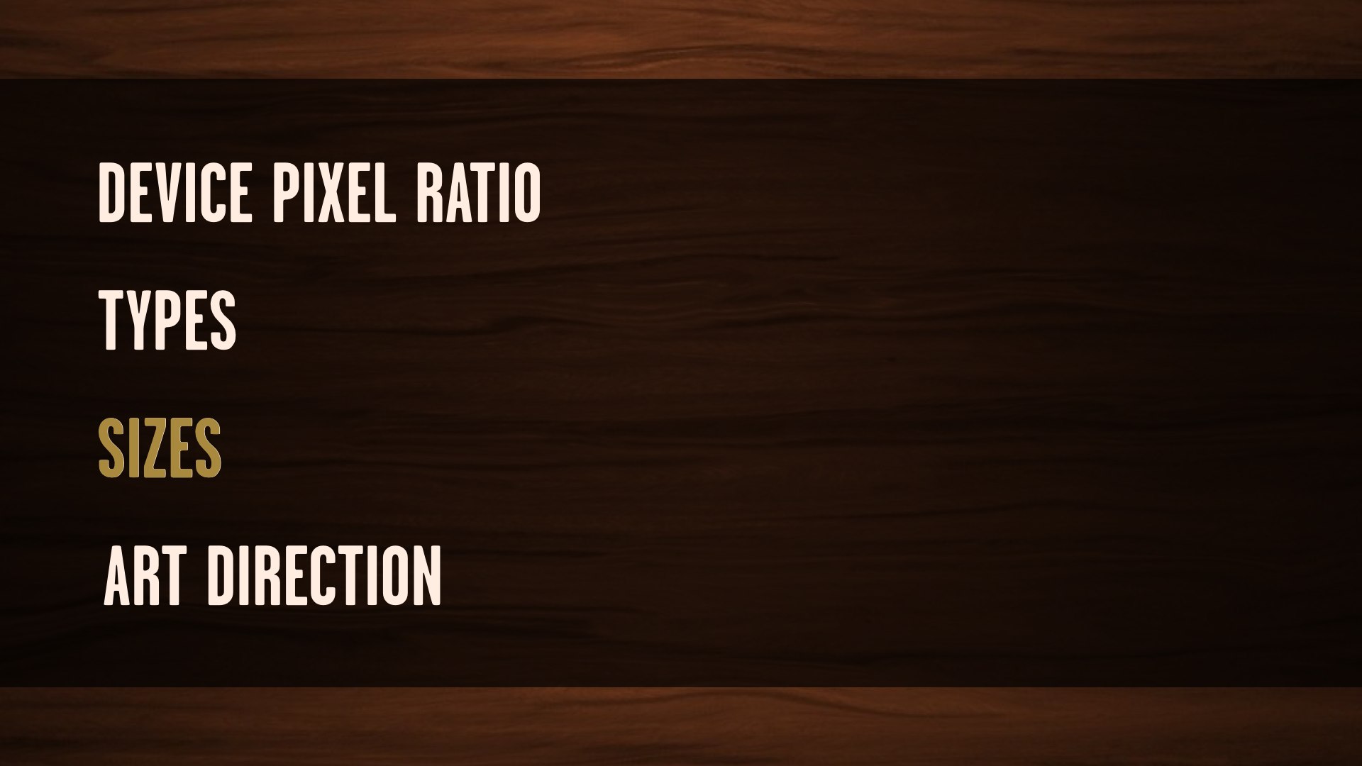
The sizes attribute is a big deal. It’s the culmination of three years of responsive images discussion, by which I absolutely mean “mailing list arguments.” We all wanted a way to provide a set of image sources that are selected only when they’re appropriate for the size of the image in the layout and all of the user’s browsing conditions—device pixel ratio, bandwidth, all of it. That’s a tall order from a spec standpoint, but couldn’t be simpler from a developer standpoint: we wanna have our CMS generate a couple of different cuts of an image and some markup to match, and we don’t want to think about responsive images much further than that.
We’ll use this markup in any situation where don’t need explicit control over image sources—so, all the sources are identical except for their sizes.
The lede image on HBR article pages is a good example of this. We’re not doing anything to change the cropping or zooming of the image across our breakpoints—we’re just scaling a large image to fit the layout. So, plain ol’ max-width: 100%.

<img
  sizes="100vw" srcset="small.jpg 400w, med.jpg 800w, big.jpg 1600w"
  src="small.jpg" alt="…">
The sizes syntax—in concert with srcset—allows us to provide the browser with a couple of sources and some information about them, then let it completely take the wheel. The viewport size and pixel density—all the information the browser has at hand is factored in, and the best applicable source is chosen automatically. This also means there’s room for the browser to get creative—Firefox and Chrome’s implementations will never load a smaller size than they already have cached. What would be the point in loading another source, when the user already has an identical image that works for those viewport sizes?
It’s a little tricky to understand at a glance, though. Unlike the 1x/2x syntax we were using with srcset earlier, we’re not using it to tell the browser what to do with our sources. Instead, we’re just giving it a list of the sources and their inherent sizes. The sizes attribute then tells the browser how those sources are meant to be displayed, relative to the viewport—100vw here, for example, means that this image will occupy one hundred percent of the viewport.

<img
  sizes="100vw" srcset="small.jpg 400w, med.jpg 800w, big.jpg 1600w"
src="small.jpg" alt="…">When the browser encounters this markup, it does a little familiar responsive web design math: target divided by context, just like when we’re putting our layouts together.
Let’s say we’re looking at this markup on an iPhone, with a 320 pixel wide viewport. Our smallest image has an inherent size of 400 pixels, so 400/320 is 1.25. The next image up is 800 pixels wide, and we do the same thing—and so on.
The math we’re doing here is what the browser does when it encounters this markup: it takes that sizes value, relative to the viewport, and divides all the image source sizes against it.

<img
  srcset="small.jpg 1.25x, med.jpg 2.5x, big.jpg 5x"
  src="small.jpg" alt="…">
These calculated values then work the same way as the 1x and 2x syntax that we’d write out by hand, but specific to the user’s viewport size. If we were on a Retina iPhone with a 320 pixel viewport, the browser would choose the source that calculates to 2.5x—the closest match to 2x. If we were on a non-Retina iPhone, the browser would serve us the smallest image.

<img
  srcset="small.jpg 1.25x, med.jpg 2.5x, big.jpg 5x"
  src="small.jpg" alt="…">
If we were to view that syntax on a 640px display, the results of all that math would end up completely different.
Now the smallest version would never match, since it’s too small for a 640 pixel wide viewport. The medium source would match on low-resolution devices, and the biggest source would match on high-resolution devices. And because we’re using srcset, these are all suggestions to the browser—once there’s an option for the user to override these suggestions through a preference or a bandwidth limit, that gets factored in as well.

<img
   sizes="(min-width: 48em) 55vw, 97vw"
   srcset="small.jpg 400w,
           medium.jpg 850w,
           large.jpg 1200w"
   src="small.jpg"
   alt="…">
A sizes attribute with 100vw doesn’t make sense on the HBR site, though. These images are never one hundred percent of the viewport—in fact, the size it occupies in the viewport changes once.
Luckily, sizes allows us to specify all the information about the image’s breakpoints that we could possibly need—using good old-fashioned media queries. This is some unruly-looking markup, I know, but the effect it has is amazing.
It’s a lot to make sense of all at once—I had to try it out for myself a few times before I got the hang of it, and I helped write the spec. Once it clicks, though, you realize that it allows you to generate a couple of image sources, give the browser a little bit of information, and walk away—you don’t need to know how the browser makes its decisions. In fact, we can’t know. And that’s okay; in fact, that’s a feature.

Since the very first incarnation of the picture element—some three years ago, now—we’ve been looking to solve the “art direction” use case. It isn’t anywhere near as common as device pixel ratio or sizes; in fact, we’re not using it on HBR at all.
Art direction comes into play whenever you want to specify an alternate version of an image for different viewports—different cropping and zooming to best represent the subject of an image in different layouts. We could do this with CSS, but it wouldn’t allow us the finely grained control we might need depending on the subject of the image—we might not always want to zoom in on the center of the image, or know how much we can safely crop off the sides.

<picture>
  <source media="(min-width: 60em)" srcset="large.jpg">
  <source media="(min-width: 40em)" srcset="medium.jpg">
  <img src="small.jpg" alt="…">
</picture>
This markup will look real familiar to anyone that followed the entire responsive images saga: it’s the same markup Bruce Lawson originally proposed when we first started thinking these problems through. Multiple source elements inside of a picture element wrapper—just like the video element—with a media attribute telling the browser when they should be applied.

<picture>
  <source media="(min-width: 800px)" srcset="pic-big.jpg">
  <source media="(min-width: 400px)" srcset="pic-med.jpg">
  <img src="small.jpg" alt="…">
</picture>
On a device with 600px-wide display, the medium source is selected.
The first source with a media attribute that matches the viewport size will be selected. If we’re using min-width media queries, we want to have our largest sources first.

<picture>
  <source media="(min-width: 800px)" srcset="pic-big.jpg">
  <source media="(min-width: 400px)" srcset="pic-med.jpg">
  <img src="small.jpg" alt="…">
</picture>
On a device with 320px-wide display, the fallback img is selected.
If none of the source elements match, the fallback img is loaded as the default source—no user ends up left without an image.
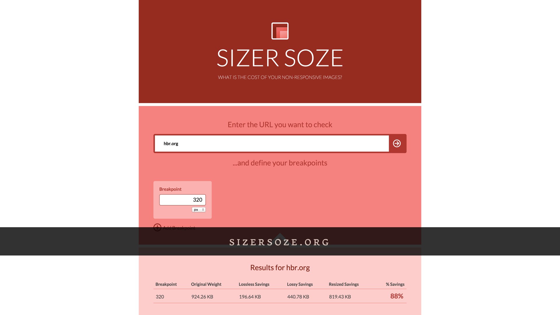
What all these different syntaxes have in common is that they all give us options for delivering only the image sources that are most appropriate to a user’s context. For a user on a 320 pixel wide display, that will all add up to reducing the image weight of the HBR homepage by an estimated eighty eight percent. We’ve still got some work to do, and none of this is live just yet—but as far as the markup goes, this work took one of us a couple of hours. It’s complicated at first, sure, but once it clicks, a little bit of work here goes a long way for our users.
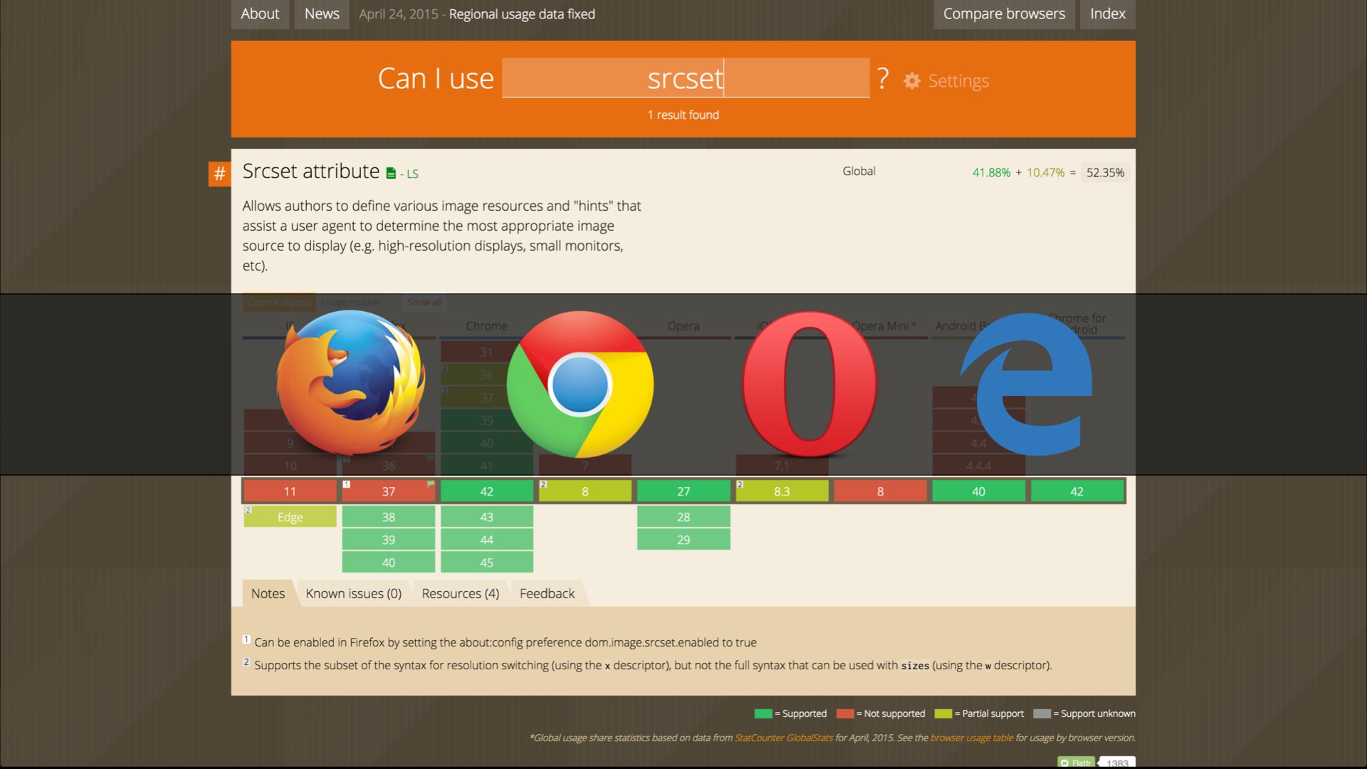
srcset
caniuse: picture
As new as these standards are, the list of supported browsers is growing fast. All these syntaxes have been available since Chrome 38, Opera 27, and Firefox 38 (with a few caveats). Last but not least: the first version of Microsoft Edge will ship with about half of these features.
For browsers that don’t yet support any or all of these syntaxes, there’s a polyfill that has us all covered. Scott Jehl wrote a script that mimicked the behavior of the picture element way back when we were writing the original spec, just to get our heads around how it might work. Since then, that script has evolved into a full-blown responsive images polyfill. picture, srcset, sizes, types, all of it.

Now that our websites are smaller, we can focus on making them even faster. And there’s sort of a plot twist here: when we talk about performance on the web, we’re not necessarily talking about making things go faster, like so many Vin Diesels. More often than not, we’re talking about perceived performance—making the site look and feel ready, even if it isn’t completely done loading out assets.
Even though they’re some of the smallest requests on the front end, requests for external stylesheets can have the biggest impact on the time it takes a page to render.

<head>
  …
  <link href="all.css" rel="stylesheet">
</head>
When we talk about performance, you’ll hear a lot of talk about “blocking requests”—meaning that the page won’t even start to render until those assets have been requested and fully transferred. There’s a good reason for that: if our CSS didn’t block, we’d see flashes of unstyled content as the page loaded—a flash of plain text before the CSS is applied. But for assets that might not be necessary right away, we could drastically improve perceived performance by avoiding that blocking behavior.

<head>
  …
  <link href="all.css" rel="stylesheet">

  <link href="medium.css" media="(min-width: 35em)" rel="stylesheet">

  <link href="large.css" media="(min-width: 55em)" rel="stylesheet">
</head>
In a perfect world, we’d be able to use the media attribute that we’ve come to know and love from responsive images to serve only the stylesheets that apply to the user’s browsing context.

media="…" |
iOS | Android | Chrome | IE10 | Firefox | Opera |
|---|---|---|---|---|---|---|
only all |
Downloaded | Downloaded | Downloaded | Downloaded | Downloaded | Downloaded |
handheld |
Downloaded | Downloaded | Downloaded | Downloaded | Downloaded | Downloaded |
tv |
Downloaded | Downloaded | Downloaded | Downloaded | Downloaded | Downloaded |
(min-width: 7777px) |
Downloaded | Downloaded | Downloaded | Downloaded | Downloaded | Downloaded |
(min-device-width: 9999999in) |
Downloaded | Downloaded | Downloaded | Downloaded | Downloaded | Downloaded |
(min-device-pixel-ratio: six?) |
Downloaded | Downloaded | Downloaded | Downloaded | Downloaded | Downloaded |
(dinosaurs: friggin’ sweet) |
Downloaded | Downloaded | Downloaded | Downloaded | Downloaded | Downloaded |
That doesn’t work, and there’s a good reason for that: media queries are designed to respond to changes in context; window size, resolution, and so on. If we didn’t load a stylesheet until a media query applied, we could end up with a flash of unstyled content whenever the user’s context changed. Worse, if their connection dropped out while browsing, they could get stuck with no styles at all.
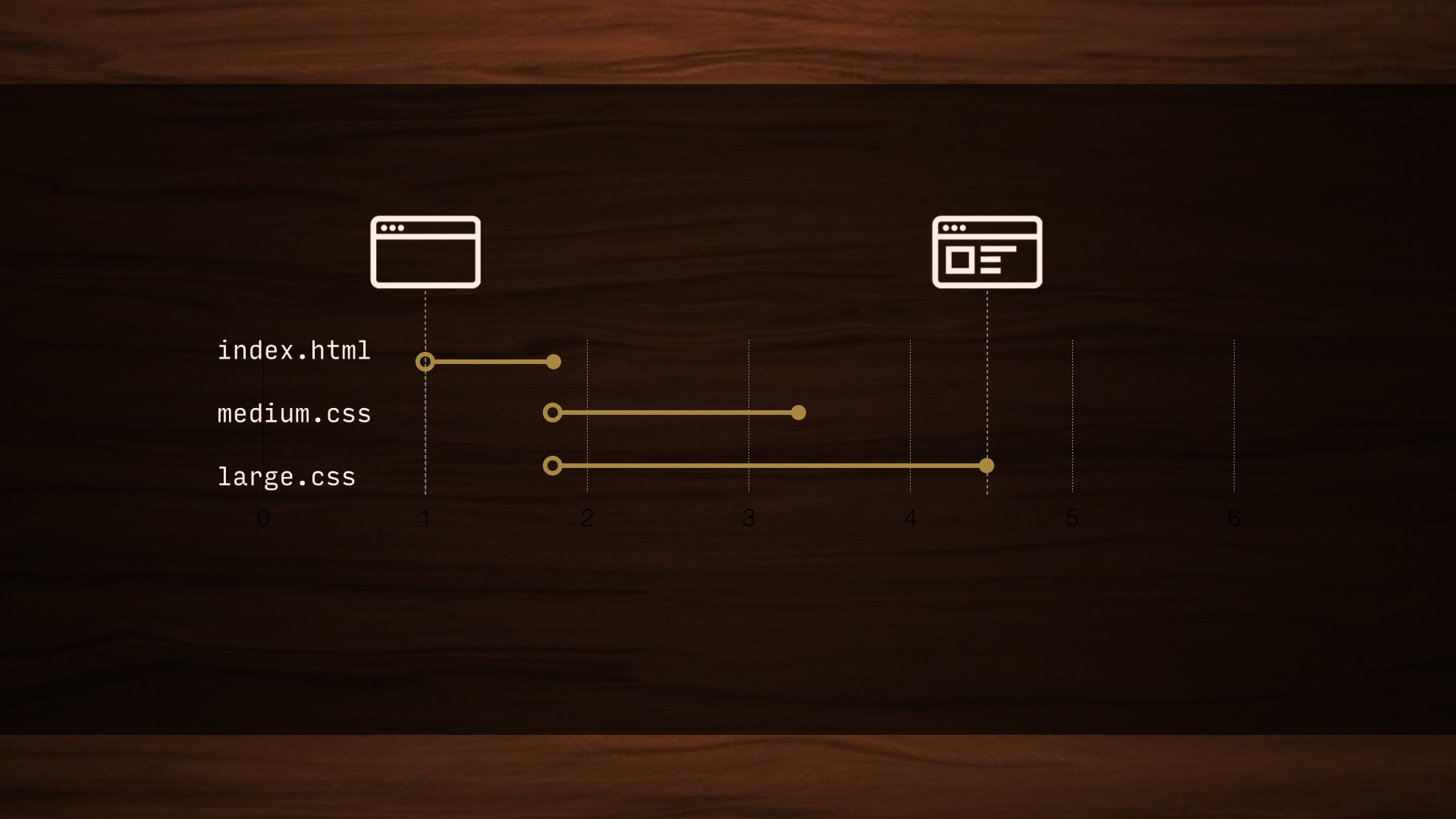
Even if a stylesheet doesn’t apply—and could never apply—it has to block the rendering of the page until that asset has been fully downloaded. We end up making users wait for assets they might never need.

<head>
  …
  <style>
    body {
      background: papayawhip;
    }
    …
  </style>
</head>
We could avoid all this—technically—by inlining all of our CSS in the head of the page. Just… bust out a copy of Frontpage and party like it’s 1999. No blocking requests, sure, but this would suck to maintain. And bloat the page. We’d also completely lose caching.

So, we’re totally gonna do this. But—hear me out—we’re going to do it in a very calculated way.
A new TCP/IP connection can include up to 10 TCP packets—about 14KB of data—in the very first response from a server. That’s more than enough to get our markup into the browser, but doesn’t include any external requests. Just the markup… and any styles that we inline in the head of the document.
If we inline our “above-the-fold” styles and include them in that initial 14KB transfer, we could deliver a visually complete page in as much time as it takes to make an initial TCP/IP connection.

Now, we’d never want to take the time to comb through all our CSS for those above-the-fold styles; this is a case for automation. This Grunt task renders the page in a headless browser and parses out all the necessary styles into their own stylesheet, ready to be included in the head of your page.

<head>
  <style>
    /* Critical CSS goes here */
  </style>

 <script>
 function loadCSS( href ){
 …
 }
 loadCSS( "all.css" );
 <script>
 <noscript>
 <link href="full.css" rel="stylesheet">
 </noscript>
</head>
The head of our pages should now look something like this. We’ll have a block of our critical CSS inlined. Once we have those styles in place, we’ll use a little JavaScript to inject all our non-critical stylesheets asynchronously. It happens quickly enough that there’s no visual lag, even if the user scrolls quickly. I inline this function as well—there’d be no sense in removing a blocking request for an external stylesheet only to replace it with a blocking request for an external script, after all. I add an old-fashioned link to the stylesheet inside a noscript tag as well, because there’s no harm.
We’ve introduced a dependency on JavaScript for all our styles, and since this is the first thing we’re running on the page, we don’t have to worry so much about JavaScript breaking down on us here. We may as well cover the small number of users with JavaScript wholesale disabled while we’re at it.
It’s easy to feel a little squeamish about a big block of CSS in the head of your documents, but you shouldn’t worry about this from a maintenance standpoint any more than you worry about minification now. Generating CriticalCSS should be a build step; you shouldn’t ever need to muck around with it by hand. This’ll be up on HBR soon too.
Once we have a page showing up as quickly as possible, we can start looking for more specific points of failure—and believe it or not, webfonts are one of the biggest ones.
Most browsers will wait about three seconds for a font to load before giving up and showing the fallback text, which is a lifetime in performance terms. But WebKit-based browsers—Safari, older Android, and Blackberry—wait 30 seconds. This is a huge single point of failure for a site, no matter how fast it loads otherwise.
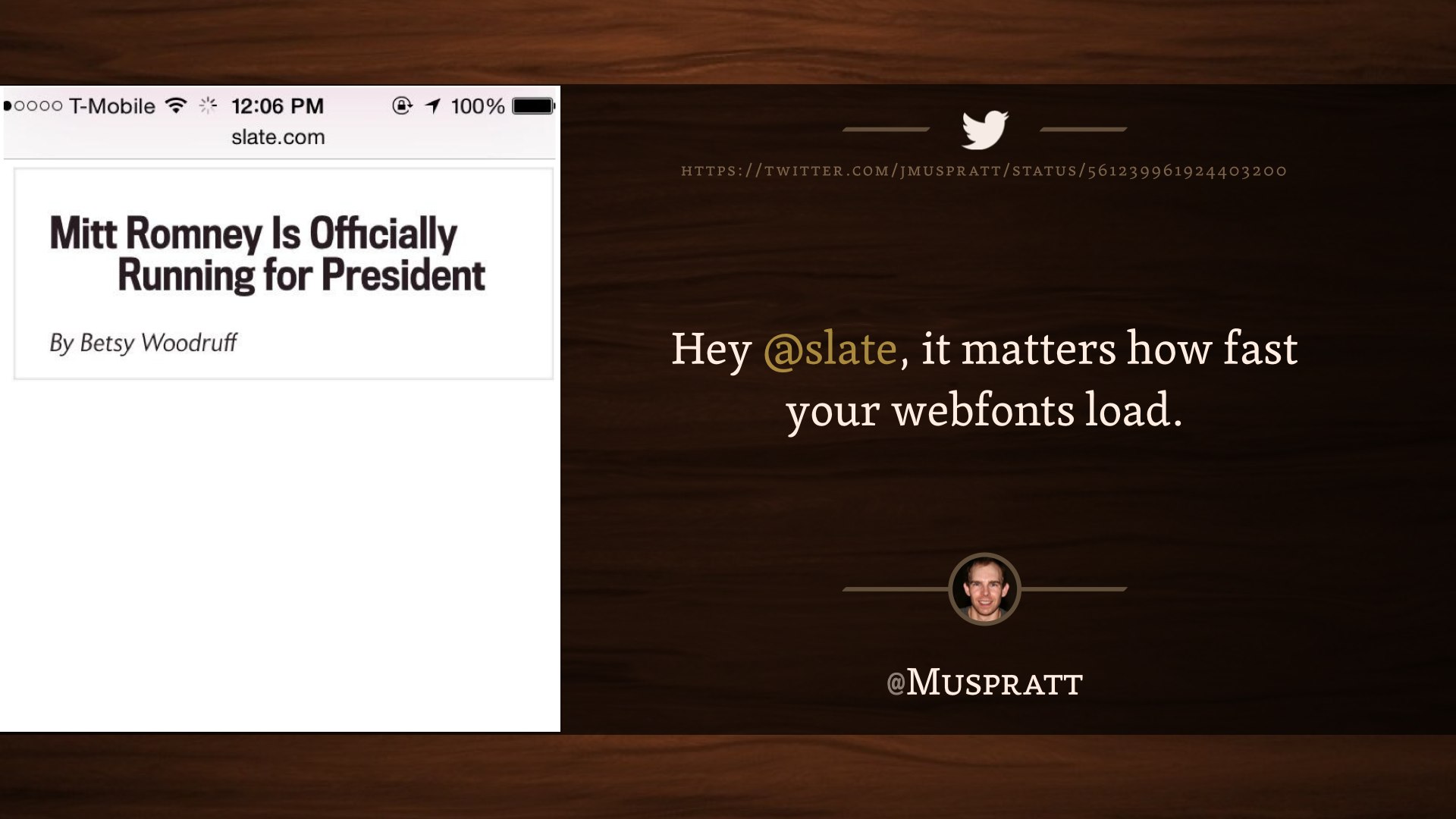
Hey @slate, it matters how fast your webfonts load. @Muspratt
And it doesn’t necessarily fail in the kind of ways we might expect.
The “not” in this headline was italicized, which meant a request for another font file. That request timed out. Things got a little scary for about thirty seconds there.
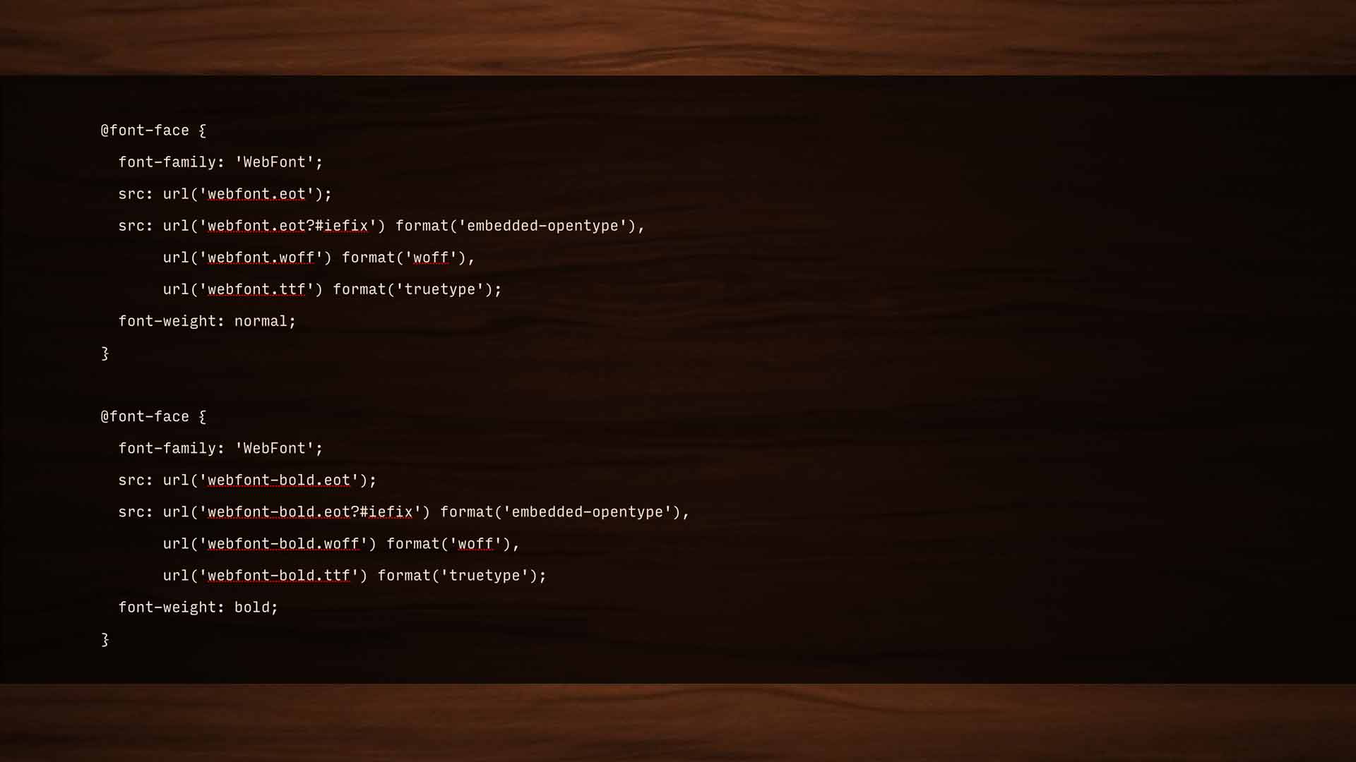
@font-face {
  font-family: 'WebFont';
  src: url('webfont.eot');
  src: url('webfont.eot?#iefix') format('embedded-opentype'),
       url('webfont.woff') format('woff'),
       url('webfont.ttf') format('truetype');
  font-weight: normal;
}

@font-face {
  font-family: 'WebFont';
  src: url('webfont-bold.eot');
  src: url('webfont-bold.eot?#iefix') format('embedded-opentype'),
       url('webfont-bold.woff') format('woff'),
       url('webfont-bold.ttf') format('truetype');
  font-weight: bold;
}
Font-face has a pretty smart syntax; the fallback pattern is built-in, so no matter what format a browser needs, we’re really only looking at one request for each file. For a while, I advocated loading all our type asynchronously—and that still works, but the issue isn’t loading the fonts so much as applying them. If our stylesheet calls for text to use a font that isn’t available at render time, that text isn’t shown until the font is available.
So, instead of messing with @font-face—and potentially breaking a really smart native loading pattern—the “font events” spec gives us a JavaScript API that tells us when our font files are fully loaded. We can then apply them to the page. Since they’re not being applied during the initial render, they won’t block rendering.

<script>
  document.fonts.ready().then(function() {
    document.documentElement.setAttribute( "class", "fonts-ready" );
  });
</script>
<style>
 p {
 font-family: sans-serif;
 }
 .fonts-ready p {
 font-family: Garage Gothic;
 }
</style>
The font events API is pretty simple; a couple lines of JavaScript to say “once all the fonts are fully loaded, add a fonts-ready class to the HTML element. Then, in our CSS, we qualify the webfont family with that class.
That’s it; you’re done. No changes to anything else.
Now you might see your fallback fonts for a split second before the webfont is loaded under bad browsing conditions, but I honestly consider that a feature—whatever it is that your user wanted to read is available right away.
This is a brand new spec; I think it’s only available in Chrome. Bram Stein put together a great polyfill for it, though.

Too many times woodworkers make something and think it’s nice, but it doesn’t solve problems for people. Rich Robertson
So, listen. If you’ll indulge me, I’m gonna talk about woodworking one last time—and I’m gonna talk about myself a little bit after all.
I wasn’t a fancy woodworker, prior to a few years ago. I was a contractor; I did grunt work. Additions; roofing. If you live in Cambridge, I might have built your porch. It wasn’t glamorous work; there were no intricate carvings, no exotic South American hardwoods. I never cut a dovetail. There was cheap pine and nailguns and roofing shingles nobody would ever see.
I loved that work. I loved it deeply, but not because I planned on winning any awards. It was simple, functional work. I walk by a lot of it every day—there’s a set of stairs a block from my apartment that those homeowners will have forever. They outlived my father. They’ll outlive me. No one will ever think about them when they’re carrying groceries into their home, because we did our jobs the right way. No one notices when their windows aren’t drafty, but they’d notice if they were.
That work was beautiful to me because it was invisible. Because we built purpose. We didn’t build a porch, we built the place you drink your morning coffee. We didn’t build a roof: we protected a home.

That’s the meaning I take from working on the web, as ephemeral as this medium might seem sometimes. When we work harder, we get better at doing things the right way. When we get better at doing things the right way, we build something more important than a website; something that will outlast any of us here.
We build a connection between every single person in the world and all the information in the world. We do more than just build websites—I don’t care about websites. I care about purpose.

Thank you.