Showing Missing Data in Line Charts
Posted by Peter Beshai
While working on visualizing the results of internet speed test data for Measurement Lab, it became clear that there wouldn’t always be data for every geographic location on every single day. We might go several days without meeting a minimum threshold of tests, meaning there would be gaps in our data. This is a pretty common problem when working with time series data, and one that is easily ignored by connecting the points that have data– but it feels wrong and it can be misleading at best.

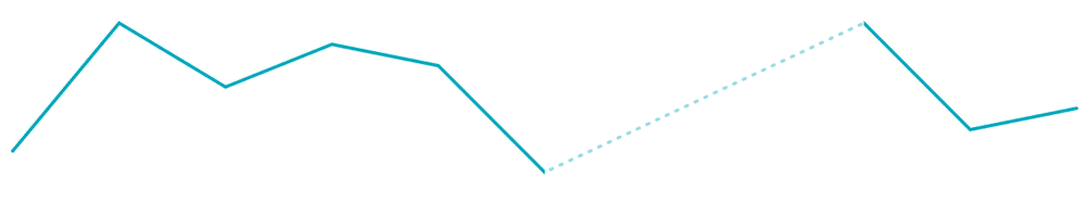
We could just connect the dots, but it’s misleading. Who knows what happened between those two orange circles?
In this post, I go over five methods to visualize gaps in your line data with D3 and analyze the pros and cons of each. This exploration led to my creation of a D3 plugin called d3-line-chunked, which allows you to easily visualize gaps in your data and has good animation support.
I’ll cover the following methods of solving this problem:
- Use d3.line.defined()
- Use d3.line.defined() with a secondary
<path> - Use a separate
<path>for each line segment - Use one
<path>with a gradient - Use two
<path>s and clipping rects
Solution 1: Use d3.line.defined()
You may not know this, but d3.line comes with a handy function called defined that lets you specify whether there is data defined for a given data point. If defined returns false for a data point, d3.line will split the path it draws into multiple segments, all within a single <path> element.
Our initial line example with the orange dots is created by the following code:
<svg width="500" height="120">
   <path id="path1" />
</svg>
var line = d3.line();
var data = [[0, 80], [50, 20], [100, 50], [150, 30],
  [200, 40], [250, 90], [400, 20], [450, 70], [500, 60]];

d3.select('#path1').attr('d', line(data));
Here we are representing our data in the d3 default [x, y] form. If we want to indicate there is missing data at x values 300 and 350, we can update our data to include null values at those points and supply a defined function that checks for the y value being null.
var line = d3.line()
  .defined(function (d) { return d[1] !== null; });

var data = [[0, 80], [50, 20], [100, 50], [150, 30],
  [200, 40], [250, 90], [300, null], [350, null],
  [400, 20], [450, 70], [500, 60]];

d3.select('#path1').attr('d', line(data));
With these updates, we get a path drawn with gaps in it:
Note that from here on, we will be indicating points with data with  and points without data with
  at the top of the examples.
Animation Test
Rendering a gap in a line works pretty easily when using defined, so let’s take a look at how it performs when animating from one set of data to another.
(Source)
As you can see, the animation is a bit jarring.
- When transitioning to a path with fewer points, the paths immediately shorten without any animation and then the shortened paths animate.
- When transitioning to a path with more points, the paths immediately lengthen without any animation and then the lengthened paths animate.
I wrote a plugin to help fix these problems called d3-interpolate-path (blog post), but unfortunately, it does not support a single path having multiple segments, so we can’t use it to improve the animation here.
Advantages
- Just set
.defined()on thed3.lineyou are already using.
Disadvantages
- You must have data points in your data array for each point of missing data so that
definedcan check them and return false - Animation behaves poorly when missing data is in different
xvalues and when there are different number of points in the destination path. - No ability to style the missing area
Solution 2: Use d3.line.defined() with secondary <path>
Solution 1 was fairly straightforward, which can be appealing especially if you don’t mind its animation issues. And with a bit more work, we can incrementally improve Solution 1 to enable us to style the missing gaps in the data. We’ll do the same setup as in Solution 1, except we’ll also add in another line, the gap line, beneath our original line, the segments line. The gap line can be styled like any other <path> element and we can have it fill the gaps between the undefined data by filtering out the missing data before rendering it.
Let’s take a look at the code to do this:
<svg width="500" height="120">
   <path id="segments-line" />
   <path id="gap-line" />
</svg>
var line = d3.line()
  .defined(function (d) { return d[1] !== null; });

var data = [[0, 80], [50, 20], [100, 50], [150, 30],
  [200, 40], [250, 90], [300, null], [350, null],
  [400, 20], [450, 70], [500, 60]];

var filteredData = data.filter(line.defined());

d3.select('#segments-line').attr('d', line(data));
d3.select('#gap-line').attr('d', line(filteredData));
Note that line.defined() with no argument works as a getter, returning the function we passed in earlier.
Cool, so that solves our styling issue.
Animation Test
We expect the same animation issues as in Solution 1, but let’s see how they look with the gap line added.
(Source)
We still see the same problems as Solution 1, but I actually perceive it as a bit smoother when all the segments appear to be connected by the dotted line.
Advantages
- All done by two
<path>s using your existingd3.line - Can style the gaps between defined line segments since they are just part of the gap line
<path>element.
Disadvantages
- You must have data points in your data array for each point of missing data so that
definedcan check them and return false - Animation behaves poorly when missing data is in different
xvalues and when there are different number of points in the destination path.
Solution 3: A separate <path> for each line segment
We’ve seen that using an extra <path> tag for the gap line can let us style it and may even improve our perception of the animation, but the animation still needs work. Let’s see what happens if we model each segment in the segments line as its own <path> element.
To start things off, we’ll need to compute where the line segment boundaries are. You can do this however you like. I’ll use computeSegments. One of the benefits of computing the segments manually is that we are no longer required to have items in our data array for points with no data. For example, the linked computeSegments function takes an isNext function to determine if we have reached a segment boundary by comparing adjacent points.
<svg width="500" height="120">
   <path id="segments-line" />
   <path id="gap-line" />
</svg>
var defined = function (d) { return d[1] !== null; };
var line = d3.line();
var data = [[0, 80], [50, 20], [100, 50], [150, 30],
  [200, 40], [250, 90], [300, null], [350, null],
  [400, 20], [450, 70], [500, 60]];

var segments = computeSegments(data, defined);
var filteredData = data.filter(defined);

d3.select('#segments-line').selectAll('path').data(segments)
  .enter()
  .append('path')
    .attr('d', line);
d3.select('#gap-line').attr('d', line(filteredData));
It looks the same statically, so that’s good.
Animation Test
How does it look with animation?
(Source)
Okay, that looks terrible. Maybe this was a bad idea. But let’s not quit just yet, let’s see how it changes if we render the gap line as a bunch of individual <path> elements too. We’ll need some way to compute line segments for the gaps in our data. I’ll use gapsFromSegments.
(Source)
That’s an improvement, but it’s still pretty bad. This time however, we can try out using d3-interpolate-path and see if it fixes our issues.
(Source)
That makes things better! Now when the segments grow or shrink they do so smoothly. However, we have a new problem: the line doesn’t animate as one single unit, it animates like a bunch of separate chunks. This makes sense, given how it’s coded, but it’s definitely not ideal. We’ll explore other methods to fix this problem next.
Advantages
- All done by many
<path>s using your existingd3.line - Can style the gaps between defined line segments since they are just part of the gap line
<path>element. - With the right segment computation function, it can work even without having entries for the missing points in the main data array. We can use an isNext function to figure out if we have reached a segment boundary.
Disadvantages
- Have to compute the segments yourself
- Animation behaves poorly due to the
<path>elements moving independently, breaking the illusion of a single continuous line.
Solution 4: One <path> with a gradient
We’ve figured out we can’t use individual <path> elements for each segment, so let’s go back to trying alternatives using a single <path>. This time we’re going to color the line differently when data is missing by generating a gradient that has color stops in at the line segment boundaries. We’ll use a helper function stopsFromSegments to compute the data needed to create the stops.
<svg width="520" height="120">
  <path id="segments-line"
     style="stroke: url(#path-segments)" />
  <defs>
    <linearGradient id="path-segments"></linearGradient>
  </defs>
</svg>
var defined = function (d) { return d[1] !== null; };
var line = d3.line();
var data = [[0, 80], [50, 20], [100, 50], [150, 30],
  [200, 40], [250, 90], [300, null], [350, null],
  [400, 20], [450, 70], [500, 60]]
var filteredData = data.filter(defined);
var segments = computeSegments(data, defined);

var xDomain = [0, 500];
var stops = stopsFromSegments(segments, xDomain);
var gapColor = '#cbf9f9';
var segmentColor = '#0bb';

// draw the segmented line
d3.select('#segments-line').attr('d', line(filteredData));

// initialize the gradient stops
d3.select('#path-segments').selectAll('stop').data(stops)
  .enter()
  .append('stop')
    .attr('offset', function (d) { return d.offset; })
    .attr('stop-color', function (d) {
      return d.type === 'gap' ? gapColor : segmentColor;
    });
That works all right and maybe it’s acceptable if the animation is good. Unfortunately we can’t change the stroke-dasharray with the gradient so we can’t exactly reproduce the styles from the other solutions. Note that we could, however, use transparent as the gapColor to make the gaps appear similar to Solution 1.
Animation Test
Since we’re only using a single <path> element, we can use d3-interpolate-path again to make the animation work a bit more smoothly. We’ll have to do some additional work to get the gradient stops to animate as well.
(Source)
Now that’s progress!
Advantages
- Animation performs really well
- Can partially style the gaps between defined line segments
- With the right segment computation function, it can work even without having entries for the missing points in the main data array. We can use an isNext function to figure out if we have reached a segment boundary.
Disadvantages
- Cannot fully style the gaps between defined line segments– we are limited to what
<linearGradient>can do. In particular, we cannot setstroke-dasharrayorstroke-width. - Cannot have other gradients defined on the line (e.g., for illustrating thresholds)
- Have to compute the segments yourself
- Have to compute the color stops data yourself
Solution 5: Two <path>s and clipping rects
Solution 4 solved our animation problems, but limited our abilities to style the line. We can get around these problems by using a similar two <path> approach as done in Solution 2, but instead of using .defined() to indicate where the gaps are in our data, we will compute the segments ourselves and use those to create clipping rectangles.
<svg width="520" height="120">
  <path id="segments-line"
     style="clip-path: url(#path-segments)" />
  <path id="gap-line" />
  <defs>
    <clipPath id="path-segments"></clipPath>
  </defs>
</svg>
var defined = function (d) { return d[1] !== null; };
var line = d3.line();
var data = [[0, 80], [50, 20], [100, 50], [150, 30],
  [200, 40], [250, 90], [300, null], [350, null],
  [400, 20], [450, 70], [500, 60]];
var filteredData = data.filter(defined);
var segments = computeSegments(data, defined);

// draw the segmented line
d3.select('#segments-line').attr('d', line(filteredData));
d3.select('#gap-line').attr('d', line(filteredData));

// initialize the clipping rectangles
// d[0] is the first data point in the segment
// d[d.length - 1] is the last data point in the segment
d3.select('#path-segments').selectAll('rect').data(segments)
  .enter()
  .append('rect')
    .attr('y', 0)
    .attr('height', 100)
    .attr('x', function (d) { return d[0][0]; })
    .attr('width', function (d) {
      return d[d.length - 1][0] - d[0][0];
    });
Ok, so far, so good. We have our dotted line back and everything looks copacetic. Let’s test some animation!
Animation Test
In Solution 4, we were able to get smooth animations using d3-interpolate-path and gradient stops, so we should be able to reproduce those results here by animating the clipping rectangles in a similar way.
(Source)
We did it! Great animation and flexible styling. The animation could get even better, but why bother? Just use d3-line-chunked, it already contains a few other optimizations, including smart enter and exit animations of clipping rectangles that prevent unnecessary movement on the line.
There’s a plugin for that
It’s a lot of work getting everything right for these lines, which is why I made d3-line-chunked. Let’s end by taking a look at how to get the examples we’ve been looking at working using the plugin.
<svg width="520" height="120">
  <g id="path1"></g>
</svg>
var defined = function (d) { return d[1] !== null; };
var lineChunked = d3.lineChunked().defined(defined);

var data = [[0, 80], [50, 20], [100, 50], [150, 30],
  [200, 40], [250, 90], [300, null], [350, null],
  [400, 20], [450, 70], [500, 60]];

d3.select('#path1').datum(data).call(lineChunked);
(Source)
That’s it! See the GitHub page for more details on how to use the plugin.
Note: If you’re curious about seeing one of the animation optimizations, take a look at the right-most segment in this example and compare it to that in Solution 5 above.
Conclusion
We’ve covered five different methods of handling showing missing data in your line charts and analyzed the advantages and disadvantages of each. Solution 5 offers freedom to style your line as you wish while maintaining great animation support. In addition to a few other animation optimization, this was the approach used to create d3-line-chunked.
You may have noticed that in each of these solutions if there is a single point of defined data with a gap on either side it isn’t really that visible (or visible at all). d3-line-chunked solves this by rendering circles for those points. It also includes the logic necessary for animations to work with the circles without them flying across the chart during transitions.
I hope you’ve learned something about some of the different methods of rendering gaps in a line with D3 and SVG. Give d3-line-chunked a shot and let me know if you run into any issues by opening a ticket on GitHub.
Thanks for reading!