Npm By Numbers, an Analysis and Visualization of the npm Ecosystem
Posted by Irene Ros
Many of us use npm on a daily basis to manage our server-side and client-side dependencies, but do we know what goes on behind the scenes? What does the npm ecosystem look like from 10,000 feet? We set out to answer some of those questions in September of this year and are really excited to share some of our findings with you today in the form of Npm by Numbers.
At this point we encourage you to click through to the visualization itself. If you’re interested in the nuts and bolts, keep reading.
Data Source
In September we made a local clone of skimdb, which is npm’s CouchDB instance containing all the packages (sans their compiled code). It makes it an ideal resource because the size of the data is fairly small and yet it is very complete. You can see our instructions on how to create your own skimdb replica in this github repo.
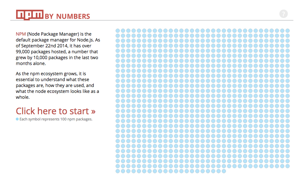
At the beginning of this project npm had just under 100,000 packages. As of today, it already has 110,362 packages! It’s grown very fast, even during our development.
Data Pipeline
Before we were ready to analyze our data, we had to actually transform our CouchDB replica into something we could parse and manipulate more easily. All of our data pipeline work can be found in this repo.
We started out by extracting all the documents out of couch and onto the file system.
Then, we proceeded to compute a variety of subsets and new datasets that cover dependency trees, keyword graphs, all releases and most importantly package metadata.
The main data file powering this visualization is generated using various subsets of this data as you can see here.
Data Extraction
We conducted our initial analysis using the Python language. There are several incredible Python libraries that allowed our data analysis to happen fast and be comprehensive. They include:
- pandas – our favorite data analysis library.
- seaborn – an incredible statistical data visualization library.
- matplotlib – the Python plotting workhorse.
You can see all of our analysis in the analysis folder of the repo. We’ve used iPython Notebooks to conduct most of our “data digging” (more on these in a minute).
Results
The npm dataset is fascinating! There were so many more questions we asked than we’ve had time to answer, but here are a few tidbits you can see in the visualization itself:
There’s a lot of discussion about semver these days. Does it mean anything? How should developers version their packages? Is the 1.0 really a big deal? Well, we aren’t going to try and answer this for the entire community, but here’s what we found:
- Most of packages on npm (82%) have a major version of
0. - Only 3% have actually gone above the
1.0mark. - 69% of packages that have a major version of
0have more than 1 released version on npm, versus 88% of those who have surpassed1.0. However, that 69% still represents over 50,000 packages, whereas the 88% corresponds to just over 3,000
An important metric of a package’s success is how many other packages list it as a dependency. We’ve taken that data and computed direct dependency lists as well as indirect dependency lists. What we mean by ‘indirect dependents’ is that if package “a” has one package that depends on it, “b”, but then there are 100 packages that depend on “b”, then “a” actually has 101 packages that depend on it! If “a” didn’t exist, then “b” couldn’t function and so on. You can see our fun code to accomplish this here.
What we’ve found looking at the dependencies is that:
- ¾ of the packages on npm, 75% (about 71,000 packages) have no other packages depending on them. By contrast only 1% of packages have more than 100 dependents.
- Only about 6% of packages have more than 5 packages depending on them.
- If we look at the top 5% packages that are dependent upon, about 3,000 of them have a major version of
0, and 600 have a major version greater than1.0.
Npm has been around for several years now (more than 3!), so data on package age makes fertile ground for analysis. The most evident fact in the package age data is that npm is growing very fast! Over half of the packages on npm (57%) have been created within the last year.
- Age is a very weak predictor of dependent count (which makes sense – older packages have had more time to get a user base, but there are enough very popular and relatively newer packages that break that trend.)
You can see a summary of the analysis in the visualization in this iPython notebook output.
Visualization
We used d3.js and d3.chart pretty heavily in this project. There are three new visualizations that we wrote with d3.chart’s help:
The animating waffle chart. This waffle chart expects an object representing each dot that captures its “membership” in the various groups it’s broken into. You can see it being used here.
The mobile version needed a separate visual interface to convey this data (We’ve actually done some pretty neat things with mobile & desktop builds, but I will leave that to another post.) We have a treemap that is displaying some of the high level breakdowns.
The opening screen on mobile has a silly collection of flying circles, urging folks to check out the visualization in a desktop browser. Those are actually a part of a d3
forcelayout that redraw themselves. You can see that code here.
Where are we now
We’ve been asked several times “can you just update this nightly?”. This is a loaded question because it has two answers: yes and no. Technically we can easily deploy our scripts and chain them together. However, there’s a pretty high level of abstraction and analysis applied to the data to then determine how to tell this story. We chose to create an interface that offers an exploration of the data but also shares some insights, and those might change. For example: what if after 6 months some of these facts are no longer relevant? The fact is, npm will change. Npm By Numbers is a glimpse into how it looked on September 22nd of 2014.
What can you do:
We’ve only scratched the surface. If you’re interested in exploring the npm ecosystem further, here are a few pointers:
- We’ve only looked at the
dependenciesspecified in thepackage.jsonfor each package. Not at thedevDependencies. The data is there, and the results are very different (imaginelodashandgrunteverywhere!) - There’s a pretty glaring lack of data here when it comes to looking at dependencies – specifically that a lot of Node.js applications use npm packages but never get published on npm themselves. An example of this is
expresswhich is obviously popular but is rarely a dependency of another module. There is an API for download data which we weren’t aware of at the time. - We have a lot more data than we were able to get to. The data is there and we’d love to see what you do with it!
This is a small glimpse into the kind of data visualization work we do here at bocoup. We’d love to help you visualize your data! Get in touch hello@bocoup.com.