Nom: My Process For Designing a Restaurant Site
Posted by Greg Smith
In the world of web design it’s more common to condemn or praise existing work than it is to talk about the actual process of creating something great. For example, over the years I’ve complained more and more about restaurant websites. I don’t just mean the ones that play background music, rely on Flash, use huge PDF downloads, and don’t work on your phone. It’s pretty easy to nitpick those problems. No, I mean when you want to get a restaurant’s phone number, address, or hours, and you just can’t find it. Is the information you’re looking for under Contact? About? Locations?
My usability-sense tingles in a Spider Man-esque fashion every time I see a site with an “About” page that is just a mess of random information that didn’t fit anywhere else. Ah, I think, the old “Miscellaneous” category. An anti-pattern that indicates that the navigation was designed without a full assessment of the site content. They probably just copied how other restaurant sites do it. This kind of copying has yielded institutionalized conventions that confuse and frustrate users. Furthermore, not all restaurant sites have the same content, so they shouldn’t all have the same navigation.
As they say, it’s easy to criticize. I’ll put my Monopoly Money where my mouth is and share my design process for creating a website for an imaginary restaurant called Nom. The content is all open source, so you’re free to use any of it as you’d like. But, since not every site is the same, just open-sourcing my work isn’t enough. That’s why this article is a writeup of my process for designing the Nom site. If you learn some new tricks for designing easy-to-use websites from this article, that’s even more important! So let’s get started.
Objectives
Every design project should start with an assessment of objectives. For some businesses this can be an interesting strategy question, but for a restaurant it’s pretty obvious. The user objective is to determine if they want to visit the restaurant, then plan a visit once they’re decided. The business objective is to convince people to visit, then help them plan their visit. Conveniently, the user and business objectives are almost the same. This might seem obvious, but it’s important to establish it at the beginning. You should be open to the possibility that your stakeholders’ objectives do not align: part of a designer’s job is navigating (or even embracing) such complications. Everything that follows should be traceable to these foundation objectives. If you start planning a feature that doesn’t seem to have anything to do with these objectives, you need to ask yourself: is the feature really necessary, or do the objectives need to be revised?
Requirements
Since Nom isn’t a real restaurant, and there are no real stakeholders to confer with, my requirements are going to be made-up. I made my requirements list by visiting 3 of my favorite restaurant websites and writing down all the content from those sites.
For a real site the requirements discovery process is a little more complicated. One process I like is using user research to create Personas, which are imaginary characters that represent the different types of users for your site. From Personas you can create Stories, which can then be distilled into a list of content and feature requirements.
I noticed that some of the content was not related to the site objectives I started out with. I will add “Helping business contacts get in touch with us” as a site objective.
Information Architecture
Information Architecture is the process of organizing information so that it can be easily understood and navigated. There are a variety of techniques for doing this, but the most important part is making sure you understand your content holistically before you attempt to structure it and design navigation.
I started out by taking my content list and clustering related content into coherent groups using Scrapple (notecards or a whiteboard would work too). Then I gave names to the naturally-occurring content clusters. The end result looks like this:
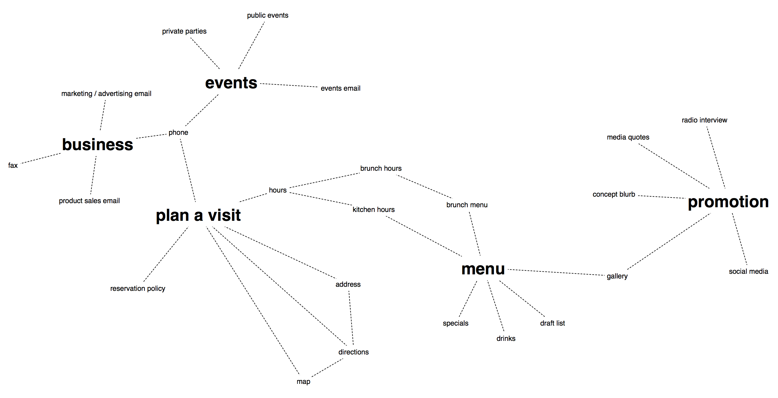
Happily, I noted that neither “About” nor “Contact” clusters appeared. Those notions are spread throughout the site, so it’s hard to make clusters around them.
I decided to move forward assuming these clusters could map to pages on the site. The following is a rough Interaction Diagram that shows the flow as different types of users visit these pages.
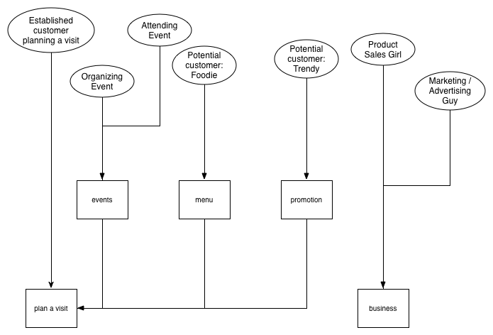
This Interaction Diagram is simple enough to summarize in words. Visitors to the site will end up at either “Plan a Visit” or “Business”. Visitors may visit one of “Events”, “Menu”, or “Promotion” before they “Plan a Visit”.
We started out with a lot of content, but we’ve reached a great way to organize it. Next we’ll get specific about what those pages will actually look like.
Interface Design
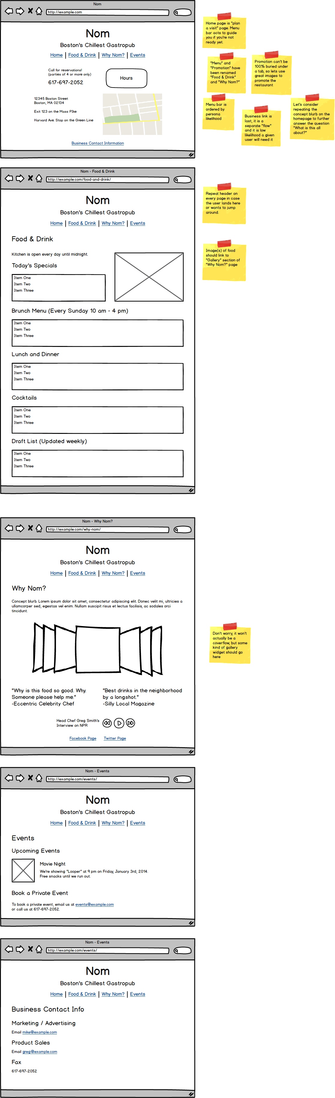
One common mistake for a lot of web projects is doing wireframes too early in the process. Our understanding of our project has evolved quite a bit since we first started. If we had developed wireframes based on our early ideas it would be based more on assumptions than actual research. Now we’re ready to transform each blank box in the Interaction Diagram into an interface.
I used Balsamiq for these wireframes. I find Balsamiq easy to use and it’s convenient to make wireframes that look like blueprints, not a finished product. It’s important to make sure wireframes don’t contain visual or graphic design work. That needs to be done after the wireframes are finished. I’m doing this project by myself, but on many teams the visual designer would be a different person.
Here is what I came up with:
Prototype and Visual Design
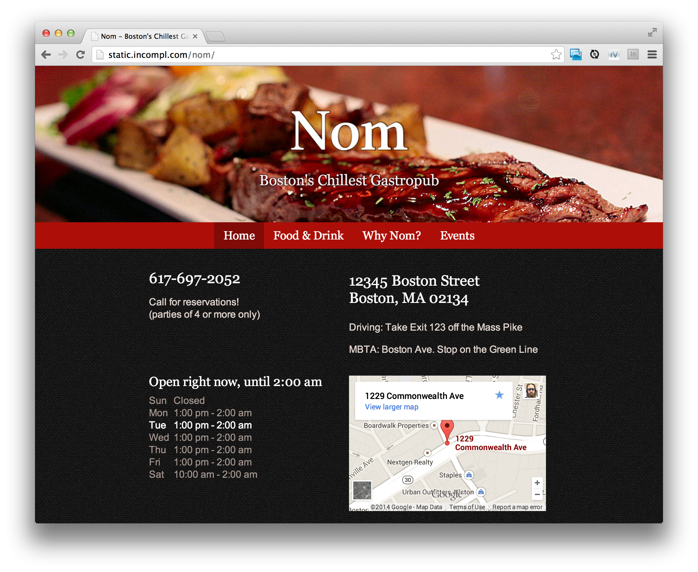
Now that we have wireframes, the next step is to do the visual design for the site. In many cases a designer would make mocks that the developers would work from. Tools like Easel.io can be useful to create designs that are easier to transform into a prototype. In my case, I made the design and the HTML + CSS prototype at the same time since it was relatively straightforward.
Visual Design should both emphasize your content and communicate your brand’s personality. I went with a simple design that showcases awesome food images that I found through Flickr Creative Commons search. The color scheme draws attention to the important content while communicating a modern vibe.
From Prototype to Functional Site
In this case all the prototype needed was some JavaScript love to be fully functional. I had recently made Hours for this project: it’s a widget for displaying business hours according to the local time. I used Picturefill for responsive images and Swiper as a gallery widget. With these integrated, I had a functional site!
What’s next?
For a real project I’d want to do some Usability Testing next. Nothing too formal would be needed for so small a site: I’d just grab some friends and coworkers and tell them to perform certain tasks. I’d go to the restaurant and talk to people about the site. I’d have some questions in mind: for example, I thought about separating “Food & Drink” into two separate tabs. If I saw users confused about where the tap list was that might further persuade me to make the change. Just as importantly, I’d want to be on the watch for problems or ideas I never thought of!
Conclusion
I hope this article gave you some ideas for how to design great websites. Of course, I don’t think this is the only way to do it. I don’t want anyone to think I’m advocating this as the One True Way to design websites. Rather, I hope by sharing my process I’ve provided ideas that you can incorporate into yours.
The Nom site itself is open source, so feel free to use parts of it or fork it to try out your own ideas!