Mapping the Conflict in Syria – a Design Process (Part 1 of 2)
Posted by Irene Ros
We’ve been very lucky this last month to join the excellent journalists and editors at GlobalPost on their journey to document the conflict in the Middle East. Several months ago, GlobalPost reached out to us for help with several new long narratives they had in the works. The first narrative, which focuses on the state of Syrian refugees, is now live. In this blog post, we want to share with you all how interactive pieces like this come to life here at the Bocoup Data Visualization Team headquarters, and what we learned about technology and process along the way.
You can read the GlobalPost piece here.
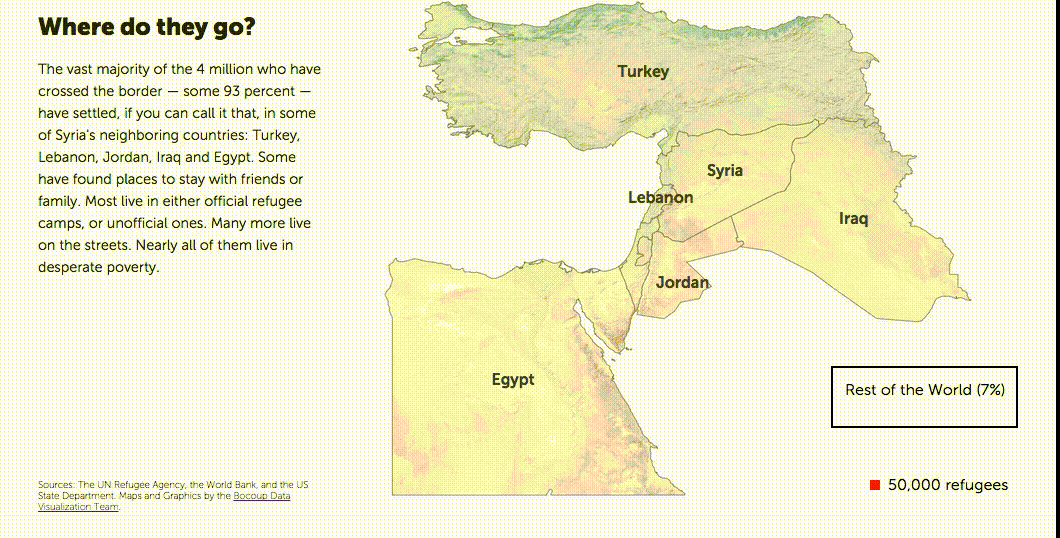 One of three visualizations exploring the number of refugees from Syria in neighboring countries. See it live here.
Choosing a question
When we started our work with GlobalPost staff, the story was still evolving. Stories like this aren’t written in a corner office—they are written on the go, often under challenging and uncertain conditions, so we needed to work with small bits as they came in. We knew this first story would be about Syrian refugees, and we wanted to explore visually their migration out of Syria to try and answer, “Where are Syrian refugees going, how many of them are there and who is helping them along the way?”
Finding Data (is Hard)
We found a dataset of the number of refugees leaving Syria and their destination countries on the UNHCR website. The more sources we scoped, the harder it became to reconcile some of these numbers and the discrepancies among the different sources. Tracking refugee numbers in times of conflict is a challenging task for a host of contextual reasons. We had to cross-reference several datasets to verify our numbers were in agreement with each other.
We also made use of a dataset cataloguing refugee camps by the Humanitarian Information Unit at the US State Department. We explored using additional datasets such as country populations from the World Bank.
Lastly, we needed data for our maps. We sourced our collection of raster images as well as country, road, and city shapefiles from Natural Earth and our shaded relief from the USGS GMTED2010 tool.
Data Processing
Even though we found structured data to represent the measures we were looking for, there were plenty of small challenges along the way that threw off our calculations:
- We had counts for individual years, and we were unable to confirm whether or not they were cumulative. We ended up reading several reports from other organizations from the recent few years to derive the answer ourselves, and as it turns out, the numbers were indeed cumulative.
- Our data had several fields containing simply an ‘*’ character instead of a number. We were able to find a note indicating the data was being removed to protect certain refugee populations, but we weren’t sure how to count them. In the end, we used zeroes instead because we were looking for aggregate values and the results we were getting were consistent enough with reports we saw.
- One of the data sources we wanted to pull in was global indicators, such as Gross Domestic Product per Capita (GDP PCAP). We wanted to know whether the high number of refugees in some of these neighboring countries was impacting economic and social measures such as unemployment or gross domestic product per capita. Unfortunately, refugees are tracked differently in different countries, and those that aren’t officially registered as asylum seekers may or may not be considered in the calculations of global indicators. As a result, a lot of these global indicators simply weren’t factoring in the condition and impact of refugees and portrayed a very different picture from what the media was reporting.
- Our data often had small inconsistencies that threw off our calculations, such as duplicate rows or countries spliting their data across multiple rows. It required some manual verification to ensure we weren’t counting things twice while ignoring other important numbers.
Analyzing the data
In determining the right visualization technique, we spent some time trying to understand the patterns in our data. A few themes emerged quickly:
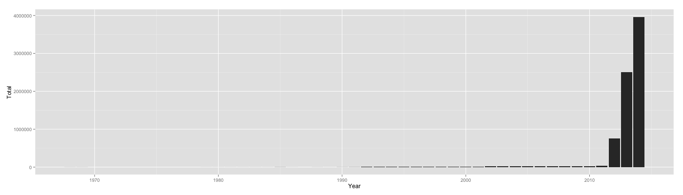
- Even though our data went back to the 1960s, the conflict we were tracking really started in 2011. There was a sharp increase in refugees in 2011, and the numbers have been growing since.
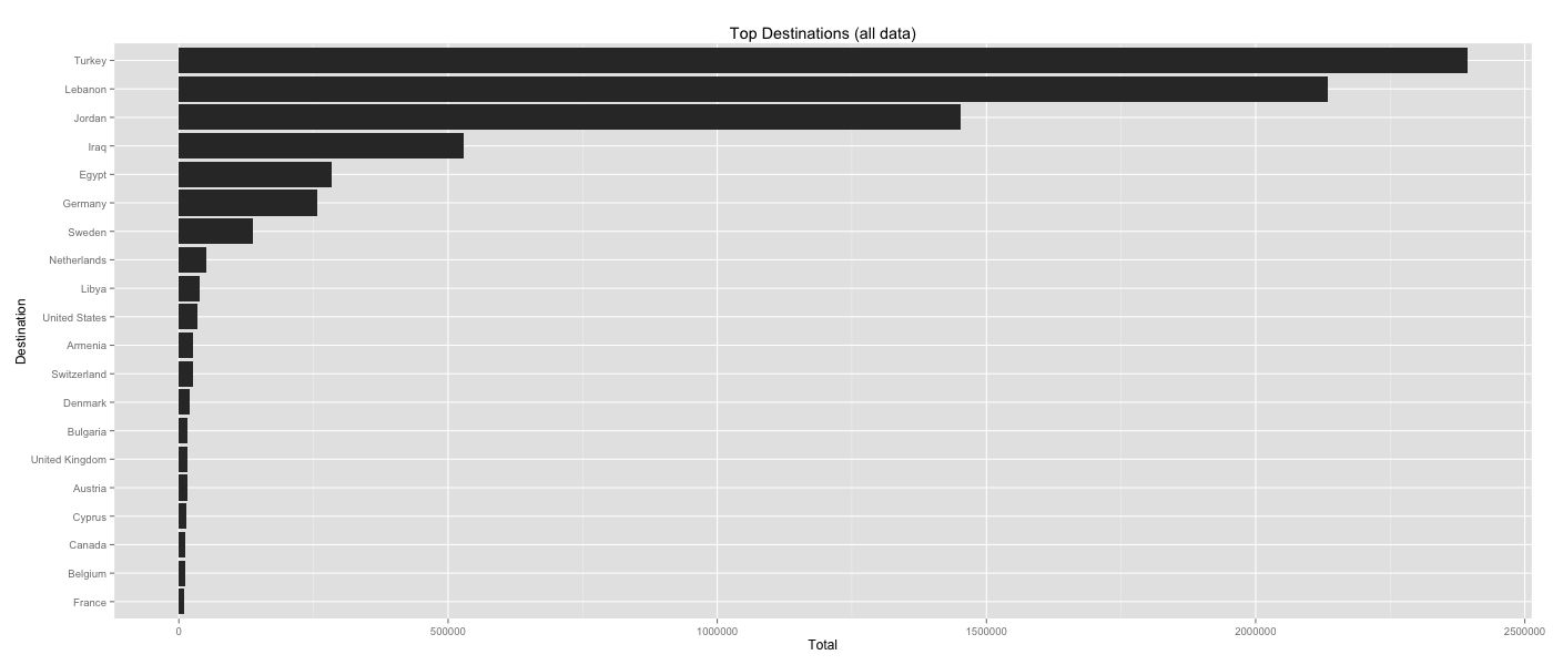
- The majority of the refugees, some 93%, were migrating to the neighboring countries. By comparison, the rest of the world was taking in much smaller numbers of refugees.
Prototyping
To find the right visual method for representing this data, we spent a lot of time building prototypes and iterating on the visualizations. We knew we wanted to use a map if possible, so our initial attempts included trying out different approaches:
Trying out a choropleth
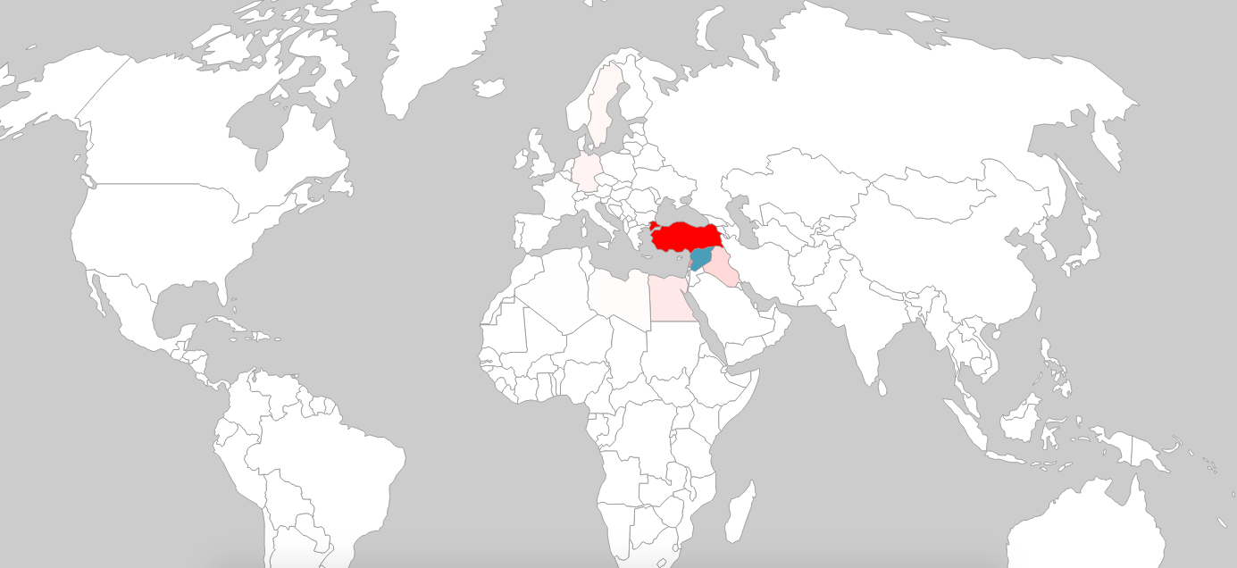 Coloring countries on a scale of white to red by the number of refugees they have taken in.
Clearly, this particular approach wasn’t going to work. We knew from our analysis that the majority of countries took a much smaller number of refugees than Syria’s neighboring countries by orders of magnitude. This comparison of countries was somewhat unfair given distance is often a substantial barrier for travel in addition to strict regulations in countries such as the US.
What about time?
We were then curious about the temporal aspects of this conflict and wondered whether a zoomed in version of this map across the last 4 years of data we had would make more sense:
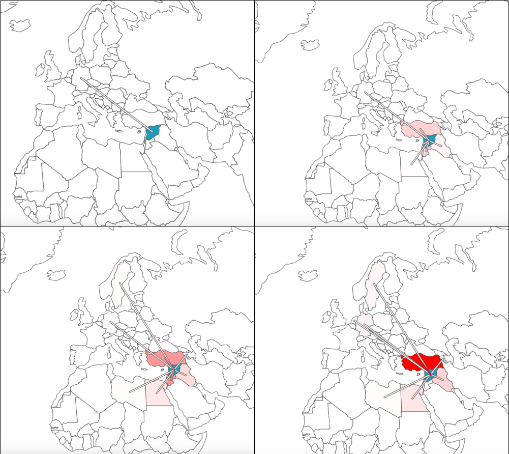 Refugee numbers from 2011-2014 in clockwise order starting with the top left. Lines connect Syria with the destination countries to try and counter some of the “lightness” of certain countries.
Even though this form certainly showed the changing numbers, it didn’t do an excellent job helping us visualize the change itself. Yes, Turkey took in the highest number of refugees and thus became redder, but by how much? And what was the change in the other countries? The change in other countries was challenging to perceive because of Turkey’s much larger intake of refugees over time. We knew this wasn’t going to work either.
Breaking out of the mold
We thought about breaking out the traditional map structure to see if an animated grid could offer an interesting interaction model. We wanted people to engage with this data and thought a more unique take would pique people’s interest:
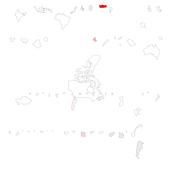 Countries arranged by population and colored by the number of refugees they took in in 2014.
As it turns out, it’s really hard to tell what countries look like when you take them out of context. As we explored this interface more, we realized we had no idea how to identify countries well. The large difference in size made our grid challenging to explore or to label easily, and in the end, we felt a little lost. Even though it was fun to rearrange the map in this way, it took away from the seriousness of this data and replaced it with confusion, which wasn’t what we were going for.
Trying out the slippy map
We wondered if exploring the data across all countries would be interesting even if the numbers were low by comparison, so we decided to try creating a full slippy map to show all the data for all the countries. We went for a very traditional approach here just to see if it clicked. We created a mapbox-based map and added a step-by-step guide through some interesting data points.
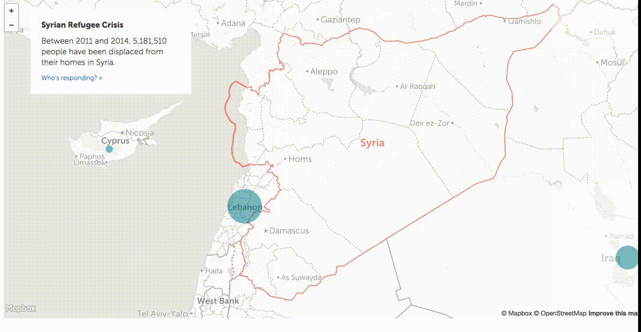
Despite this format being very common, we weren’t comfortable with the results. Aside from jumping around the map in a way that broke up the story’s continuity, the additional data wasn’t interesting to explore. We decided the narrative was getting lost in all of this interaction that wasn’t contributing to its telling.
Refocusing
We took a bit of a pause after this last experiment to think about the maps that have captured our attention as of late. Maps that are beautiful, show a lot of data, but are generally static. We owe a lot of inspiration to The New York Times for making these and to Gabriel Florit who helped steer us in the right direction through his work and open source contributions.
Making beautiful AND interactive maps
We knew we wanted to make an interactive visualization to show our data, and we wanted to do the following:
- Focus on the story
- Hyper-focus on the regions relevant for the story
- Use beautiful maps
- Use small animations in the service of the story but not go overboard
Paring down our objectives in this way allowed us to focus on the maps we wanted to create and the data we had.
Next steps
Next came the really hard part of pulling these final maps together. In part 2 of this series, we will discuss the technical implementation of the maps we made. In the meanwhile, you can see the interactive maps live here, and if you’re really anxious to see the code before then, you can find it here too.
Stay tuned for Part 2!