Dive into Flexbox
Posted by Greg Smith
Introduction
Flexbox is a new layout mode in CSS3 that is designed for the more sophisticated needs of the modern web. This article will describe the newly-stablized Flexbox syntax in technical detail. Browser support is going to grow quickly, so you’ll be ahead of the game when support is wide enough for Flexbox to be practical. Read on if you want to know what it does and how it works!
Why is Flexbox needed?
Authors have long been using tables, floats, inline-blocks, and other CSS properties to lay out their site content. However, none of these tools were designed for the complex webpages and webapps we are making nowadays. Simple things like vertical centering require work. Complex things like flexible grid layouts are so hard that it’s considered ambitious to roll your own, hence the success of CSS grid frameworks. Still, if so many projects needs to do these things, why can’t it just be easy? Flexbox aims to change all that.
Specification Status and Browser Support
The Flexbox specification has been a work in progress for over 3 years. Various browsers have implemented different versions experimentally. In September 2012, the 3rd major revision of the Flexbox syntax reached the W3C Candidate Recommendation stage. This means that the W3C is satisfied with the current syntax and is encouraging browser vendors to implement it.
Flexbox Specification Timeline:
- July 2009 Working Draft (display: box;)
- March 2011 Working Draft (display: flexbox;)
- November 2011 Working Draft (display: flexbox;)
- March 2012 Working Draft (display: flexbox;)
- June 2012 Working Draft (display: flex;)
- September 2012 Candidate Recommendation (display: flex;)
Browsers are adopting Flexbox quickly. Chrome 22+, Opera 12.1+, and Opera Mobile 12.1+ already support Flexbox as described in this article. Firefox 18 and Blackberry 10 will follow soon. I recommend reading this article in a supported browser to see working examples.
Concepts and Terminology
Though Flexbox makes it trivial to create layouts that would have been difficult or impossible in the past, it takes some time to get used to the Flexbox way of doing things. New terminology and new abstractions can be a barrier to using Flexbox, so let’s discuss them up-front.
Flexbox consists of Flex Containers and Flex Items. A Flex Container is declared by setting the display property of an element to either flex or inline-flex. With flex the container is a rendered as a block. With inline-flex the container is rendered inline.
Here is an example declaring a Flex Container.
gistfile1.css
.flex-container {
  display: -webkit-flex;
  display: flex;
}
This article will show all appropriate vendor prefixes in all examples.
Every child of a Flex Container is a Flex Item. There can be any number of Flex Items. Everything outside a Flex Container and inside a Flex Item is rendered as usual. In short, Flexbox defines how Flex Items are laid out inside of Flex Containers.
Flex Lines
Flex Items are positioned inside a Flex Container along a Flex Line. By default there is only one Flex Line per Flex Container.

Here is a simple example that shows two items as they are positioned by default: along a horizontal flex line, from left to right.
Writing Modes
An important part of customizing your Flexbox is changing the direction of the flex line. By default, the Flex Line goes in the direction of text: left to right, top to bottom.
There is a W3C Working Draft for a new feature called Writing Modes. Writing Modes are a new way to write text right-to-left, or even vertically, as you might in certain languages.
Writing Modes are a work-in-progress, but Chrome currently supports the direction CSS property. If we set the direction in the previous example to rtl (right-to-left) then not only is the text drawn right to left, but also the Flex Line changes direction, changing the page layout.
This might clarify why a lot of the Flexbox terminology is so abstract. You can’t just say “right” “left” “up” and “down” when you’re making no assumptions about the language of the page.
The Main Axis and the Cross Axis
To abstract over the writing-mode, Flexbox uses the concepts of the Main Axis and the Cross Axis. Flex Lines follow the Main Axis. The Cross Axis is perpendicular to the Main Axis.
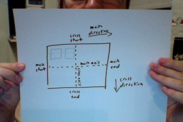
The names for the starting points, ending points, and directions of each axis are as follows:
- Main Start
- Main End
- Main Direction (sometimes called the Flow Direction)
- Cross Start
- Cross End
- Cross Direction
It is crucial to understand the Main and Cross terminology before continuing. Everything in Flexbox is relative to these axes. In all of our examples the writing-mode will be left-to-right, top-to-bottom, but you must keep in mind that this will not always be the case.
Properties of the Flex Container
flex-direction
The flex-direction allows you to change the axes of the Flex Container. The default value of flex-direction is row. With this value, Flex Items are laid out in the direction of the writing-mode. Again, that means left-to-right, top-to-bottom by default. The other values are as follows:
- row-reverse: The Main Start and Main End are swapped. If the writing-mode is left to right, Flex Items are now laid out right to left.
- column: The Main Axis and the Cross Axis are swapped. If the writing system is horizontal, the Flex Items are now laid out vertically.
- column-reverse: Same as column, but reversed.
Let’s take our previous example and change the flex-direction to column.
Now our Flex Items are being laid out vertically.
justify-content
The justify-content property of Flex Containers adjusts the positions of Flex Items on the Main Axis. The possible values are:
- flex-start (default)
- flex-end
- center
- space-between
- space-around
Here we set justify-content to center to cause Flex Items to be centered on the Main Axis:
flex-start, flex-end, and center are straightforward. space-between and space-around distribute the whitespace between Flex Items in more subtle ways. This diagram from the specification explains it best:

align-items
align-items is complementary to justify-content. align-items adjusts the way Flex Items are positioned on the Cross Axis. The possible values are:
- flex-start (default)
- flex-end
- center
- baseline
- stretch
Here we set align-items to center to cause Flex Items to be centered on the Cross Axis:
Again, the flex-start, flex-end, and center values are straightforward. stretch is also fairly simple: it causes Flex Items to be stretched out from the Cross Start to the Cross End. baseline causes Flex Items to be aligned along their baseline. Baselines are calculated based on the content of the Flex Items. This is best explained by the following image from the Flexbox specification:

flex-wrap
Up until now, every Flex Container has had only one Flex Line. Using flex-wrap you can create Flex Containers with multiple Flex Lines. The possible values for flex-wrap are:
- nowrap (default)
- wrap
- wrap-reverse
If flex-wrap is set to wrap, Flex Items wrap onto additional Flex Lines if there is not enough room for them on one Flex Line. Additional Flex Lines are added in the direction of the Cross Axis.
Here is an example using flex-wrap:
wrap-reverse is the same as wrap except new Flex Lines will be added in the opposite direction on the Cross Axis.
align-content
align-content modifies the behavior of flex-wrap. It is similar to align-items, but instead of aligning Flex Items, it aligns Flex Lines. As you might expect, its possible values are similar:
- stretch (default)
- flex-start
- flex-end
- center
- space-between
- space-around
These values are analagous to their counterparts in justify-content and align-items.
In this example we set align-content to center:
flex-flow
flex-flow is a shorthand for flex-direction and flex-wrap.
flex-flow: [flex-direction] [flex-wrap]
For example:
gistfile1.css
.flex-container {
  -webkit-flex-flow: column nowrap;
  flex-flow: column nowrap;
}
Properties of Flex Items
A Flex Item is any direct child of a Flex Container. Text in a Flex Container also gets treated as a Flex Item.
The contents of Flex Items render as normal. For example, while setting float on a Flex Item does nothing, you could have a floated element inside of a Flex Item.
Flex Items are said to have a Main Size and a Cross Size. The Main Size is the size of the Flex Item in the dimention of the Main Axis. The Cross Size is the size of the Flex Item in the dimention of the Cross Axis. Effectively, the width or height of a Flex Item may be its Main Size or Cross Size depending on the Flex Container’s axes.
The following properties adjust the behavior of Flex Items.
order
order is the simplest one. Setting orders for Flex Items adjusts their order when rendered. In this example, we set the order of one Flex Item to -1, causing it to be displayed before any other Flex Items.
This can be useful for accessibility, where the document order and the displayed order may need to be different.
margin
You may be familiar with the normal effect of margin: auto;. In Flexbox it does the same sort of thing, but it’s even more powerful. An “auto” margin will absorb extra space. It can be used to push Flex Items into different positions.
Here we declare margin-right: auto; on the first Flex Item, causing all the extra space to be absorbed to the right of that element:
Here we use margin: auto; to achieve the holy grail of CSS layout: true vertical centering:
align-self
The align-self property of Flex Items effectively overrides the Flex Container’s align-items property for that item. It has the same possible values as align-items:
- stretch (default)
- flex-start
- flex-end
- center
- baseline
In this example we give different align-self values to each Flex Item:
I included two baseline Flex Items because their alignment is only relative to one another.
flex
Now we’re finally going to put the flex in Flexbox. flex specifies how a Flex Item will be prioritized when free space is being distributed on the Main Axis.
Let’s look at each of the common values one at a time.
flex: [number]
This syntax specifies a number that represents the ratio of free space that should be taken by this Flex Item.
In this example, the first Flex Item consumes 2/4 of the free space, and the other two Flex Items consume 1/4 of the free space each:
It can be useful to set the number to 1 for every Flex Item, causing free space to be distributed evenly:
flex: initial
A Flex Item with its flex value set to initial will be inflexible when there is free space, but can shrink smaller if needed.
flex: auto
A Flex Item with its flex value set to auto will be fully flexible along the Main Axis.
auto currently works in Opera 12.11 but does not work in Chrome 23.0.1271.95. You can often work around this by using flex: 1;.
flex: none
A Flex Item with its flex value set to none will be fully inflexible in all situations.
advanced flex
flex can also be used as a shorthand for specifying flex-grow, flex-shrink, and flex-basis in one declaration:
flex: [flex-grow] [flex-shrink] [flex-basis]
Most use-cases do not require this syntax. Further, it requires a more specialized understanding of the flex algorithm. If you’re feeling brave, take a look at the specification.
You can also specify each of flex-grow, flex-shrink, and flex-basis as separate properties. I strongly recommend against this: when using the flex shorthand, more sensible defaults are applied to the values that are not given.
visibility
When it is implemented, visibility: collapse; will be distinct from visibility: hidden; and display: none; for Flex Items. With collapse, the element will affect the Cross Size of the Flex Container, but it will not be displayed nor will it consume any space on the Main Axis. This will be useful for dynamically adding and removing Flex Items without affecting the Flex Container’s Cross Size.
Currently, visibility: collapse; does not appear to be correctly implemented in any browser. visibility: collapse; appears to do the same thing as visibility: hidden; in current implementations. I expect this to change soon.
You can see a good mocked-up example of how collapse will work in the spec.
Conclusion
As you can see, Flexbox is a powerful new layout mode that will revolutionize layout for websites. As you can also see, it requires a whole new way of thinking. Hopefully this article has prepared you to start making websites with Flexbox. I don’t know about you, but it seems to me that the future is awesome.